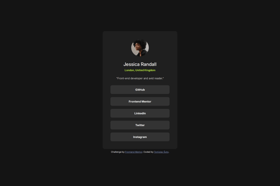
Design comparison
Solution retrospective
Managing to use flexbox layout; my attainment rises...
Had some trouble at the start; I tried to over-engineer the solution. Layout was breaking and there were too many variables. I took a step back and found it easier to use flex-end and gap to solve my problem.
Also, trying to match the design without a design file is much harder than having a Figma file.
What specific areas of your project would you like help with?Using flexbox; how would one center the main object (card) horizontally and vertically (without .attribution affecting the alignment), and still have .attribution be right below that main object, without using position on the .attribution?
Community feedback
- @DILHTPosted 5 months ago
the code is well written, and the design is much better than me :-).About the issue of centering the main object(card) horizontally and vertically. you could have put both card and the attribution in the flex container and use flex-direction column and yes, I have seen it in the code this was going to stack them vertically. Good Work Tomislav
Marked as helpful0
Please log in to post a comment
Log in with GitHubJoin our Discord community
Join thousands of Frontend Mentor community members taking the challenges, sharing resources, helping each other, and chatting about all things front-end!
Join our Discord
