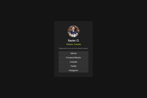
Social links

Solution retrospective
I started learning bootstrap today and tried to make this project with as little raw CSS as I could. I made some minor styling change to make it more to my taste and tried setting it up as my landing page for github. I'll have to change my btn-group-vertical to an ul with the btn as li to be able to get spacing between the btn elements.
What challenges did you encounter, and how did you overcome them?The biggest challenge was trying to translate what I spent the last week learning in raw CSS to the bootstrap that I started learning earlier today. I tried to make it more responsive, but without the figma file it was more difficult to try to get the original layout and sizing right. (though I did make some changes as I wanted the text to be bigger) I'll be starting to learn tailwind soon which should allow me better customization.
What specific areas of your project would you like help with?Looking for general feedback! I'm trying to make my code as clear and concise as I can and would love to hear alternate solutions or suggestions :)
Please log in to post a comment
Log in with GitHubCommunity feedback
No feedback yet. Be the first to give feedback on Xavier O.'s solution.
Join our Discord community
Join thousands of Frontend Mentor community members taking the challenges, sharing resources, helping each other, and chatting about all things front-end!
Join our Discord