Solution retrospective
What are you most proud of, and what would you do differently next time?
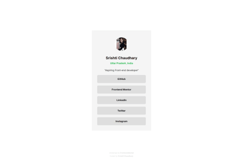
That I used flexbox and position to center the card but with responsive media query for smaller screen changed it so that user can scroll and so that the footer doesn't behave weirdly.
What challenges did you encounter, and how did you overcome them?The main challenge I encountered was to do with deciding the colors of the design.
What specific areas of your project would you like help with?I would like you to check if my html is semantic. If you have any other suggestions as well they are most welcome!
Code
Loading...
Please log in to post a comment
Log in with GitHubCommunity feedback
No feedback yet. Be the first to give feedback on Srishti Chaudhary's solution.
Join our Discord community
Join thousands of Frontend Mentor community members taking the challenges, sharing resources, helping each other, and chatting about all things front-end!
Join our Discord