Design comparison
SolutionDesign
Community feedback
- @tr-KalyanPosted 6 months ago
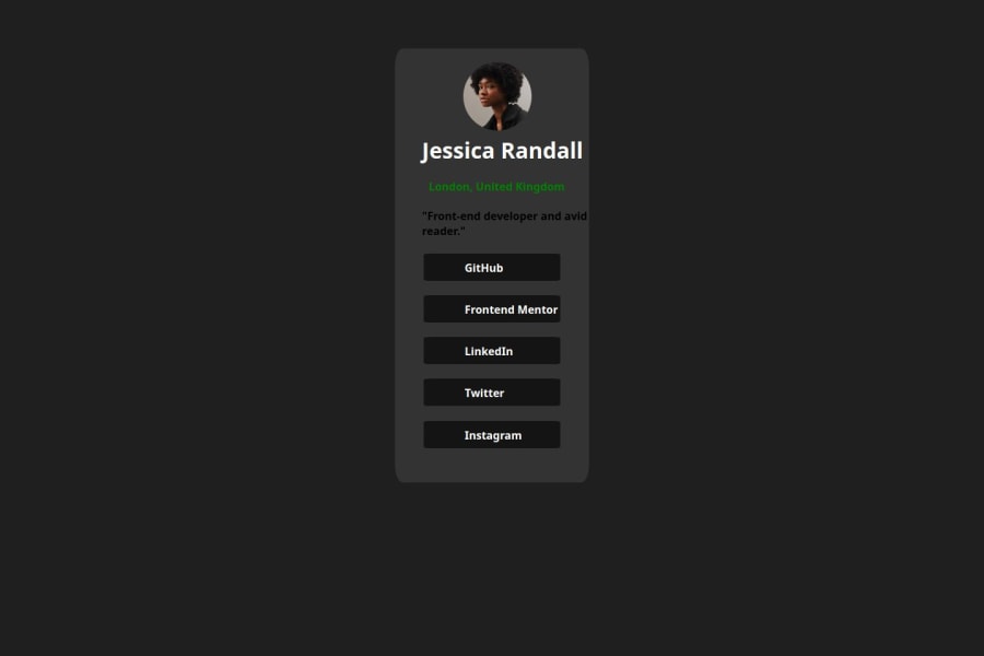
I was not able to access the Github link. Based on the solution displayed, the design looks good but need some minor tweaks. I would like to suggest few:
- Use the defined styles in style-guide file
- Using flex box can be an added advantage as we can position the text in the desired place
- Need to adjust padding and margins to make the solution look more close to the actual design
Overall the solution is almost perfect with just minor tweaks. This can be reduced as we keep practicing. Happy Leaning!
0
Please log in to post a comment
Log in with GitHubJoin our Discord community
Join thousands of Frontend Mentor community members taking the challenges, sharing resources, helping each other, and chatting about all things front-end!
Join our Discord
