

Design comparison
SolutionDesign

Solution retrospective
What are you most proud of, and what would you do differently next time?
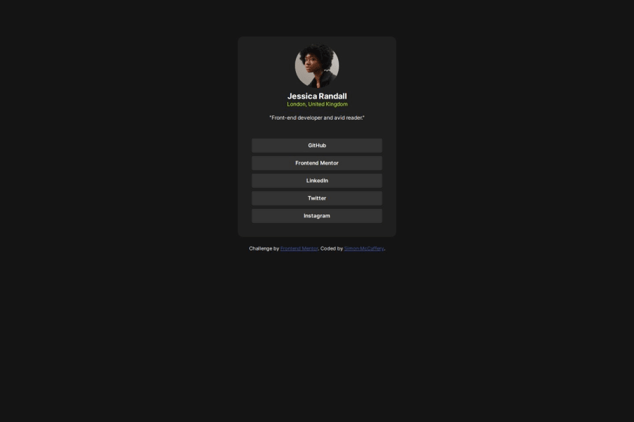
Using a media query and things managing to stay within their bounds as far as I have tested. It definitely could be improved but at the limits of my current understanding of it.
What challenges did you encounter, and how did you overcome them?Having the buttons for the links wide enough to contain the text at smaller screen sizes added a media query that removes the parent components' padding, allowing them to cover the entire width of their parent.
What specific areas of your project would you like help with?Any feedback is always appreciated, all areas of my learning need improving so I don't want to be specific yet.
Community feedback
Please log in to post a comment
Log in with GitHubJoin our Discord community
Join thousands of Frontend Mentor community members taking the challenges, sharing resources, helping each other, and chatting about all things front-end!
Join our Discord