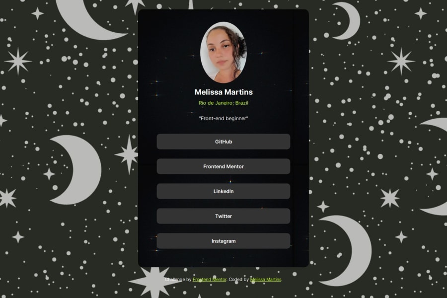
Design comparison
Solution retrospective
- I really liked using my own links on the card.
- Using less id's
- i wanted to create a function that says that i dont have a twitter or facebook -I think the code wasn't as sophisticated as I would have liked
-i had a time using the hover -I would like tips to make it responsive
Community feedback
- @AvinashKumarMahatoPosted 11 months ago
Feedback on This Solution:
-
Responsive Design:
- The design is clean and responsive, functioning well on both desktop and mobile devices. Great job using a mobile-first approach and employing CSS media queries effectively. Consider adding more breakpoints to fine-tune the layout for various screen sizes.
-
Styling and Aesthetics:
- The use of CSS custom properties for colors and spacing is excellent, making the styling maintainable and scalable. The color scheme is visually appealing, and the hover and focus states are implemented well, enhancing user interaction.
-
Code Organization:
- The HTML structure is semantic and easy to read, with appropriate use of elements like
<article>,<section>, and<figure>. The CSS is well-organized, though it could benefit from additional comments to explain complex sections or decisions.
- The HTML structure is semantic and easy to read, with appropriate use of elements like
-
Accessibility:
- While the project is visually appealing, there are opportunities to improve accessibility. For example, ensure all interactive elements are keyboard navigable and consider using ARIA roles to enhance screen reader compatibility. Check color contrast ratios to ensure text is readable for users with visual impairments.
-
Performance:
- The project performs well, but there’s always room for optimization. Consider lazy-loading images to improve initial load times and minifying CSS to reduce file sizes. These changes can help enhance performance, especially on slower connections.
-
JavaScript Integration:
- Although this project primarily focuses on HTML and CSS, adding subtle JavaScript enhancements could improve user experience. Simple animations or interactive elements (e.g., toggling content visibility) could add a dynamic touch without overwhelming the user.
-
Browser Compatibility:
- Ensure thorough testing across various browsers and devices to catch any compatibility issues. Tools like BrowserStack can help simulate different environments and identify potential problems early.
-
Future Enhancements:
- Consider expanding the project with additional features or pages, such as a detailed profile page or user testimonials. This could provide more opportunities to showcase advanced skills and enhance the overall functionality.
Overall, this solution demonstrates strong foundational skills in HTML and CSS, with a keen eye for design and usability. By focusing on the areas mentioned above, the project can be further refined and elevated. Great work!
0 -
Please log in to post a comment
Log in with GitHubJoin our Discord community
Join thousands of Frontend Mentor community members taking the challenges, sharing resources, helping each other, and chatting about all things front-end!
Join our Discord
