Submitted 9 months ago
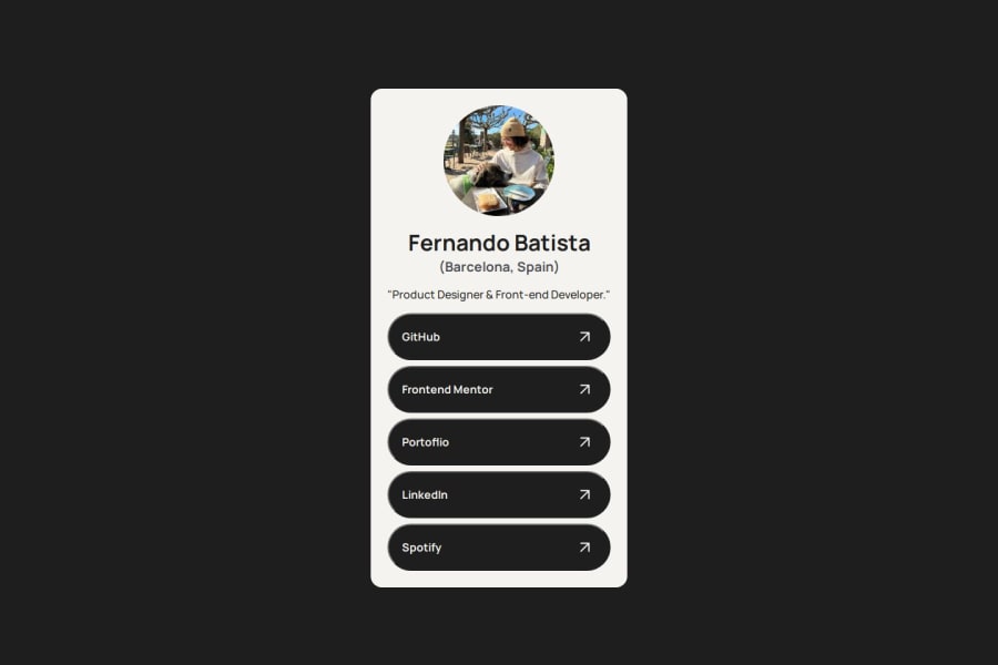
Social Links Challenge - Button States, CSS styling, Flexbox.
@FernJBatista
Design comparison
SolutionDesign
Solution retrospective
Challenges This challenge was fairly fun, I used my own branding for this project to maybe use it for myself from now on. But I did want to make the buttons show differently and couldn't figure out how for now. My idea for the buttons (which could be horrible but I haven't tried) was to set the text at the center, while putting the arrows at the end right side.
Other than that, I think I did fairly well, not many hiccups on this one. Definitely stayed away from the mistakes I made on my previous challenge.
Community feedback
Please log in to post a comment
Log in with GitHubJoin our Discord community
Join thousands of Frontend Mentor community members taking the challenges, sharing resources, helping each other, and chatting about all things front-end!
Join our Discord
