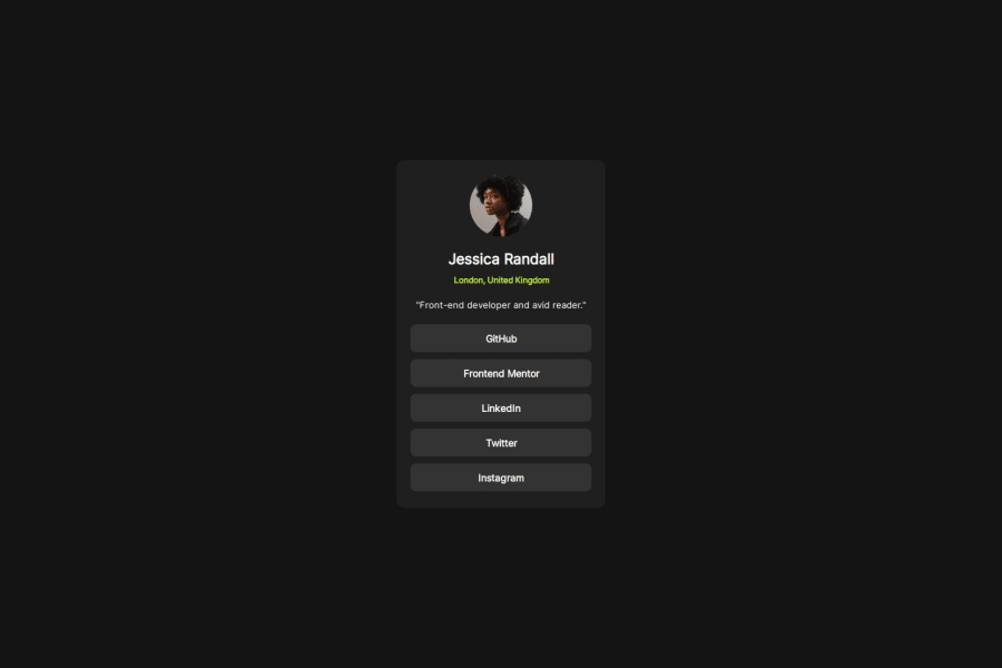
Design comparison
Solution retrospective
this is my first project which I only created using an image not figma.
What challenges did you encounter, and how did you overcome them?as I use image I have some problems in finding pixel measurements I think my website is almost similar to the design but it is so small.
What specific areas of your project would you like help with?someone please tell me how do you deal with this measurement problem. as you can see my website look similar but it is small
Community feedback
- @keltiekPosted about 1 year ago
I'm not sure if it will help you, but I'm using "Pixel Perfect Pro" extension on Chrome, and it makes it easier to follow the design without figma.
0 - @RealKendprPosted about 1 year ago
Great
I just have some suggestion:
- Instead of using fixed width & height like
px, try using a more fluid size like percentage% - Don't use H2 without using H1 first. They should be in order like:
<h1>
<h2>
<h3>
<!--etc-->
and take note, dont simply use headings just to make a text smaller or bigger than the other because they are suppose to give meaning to a content. You can instead use
<div>or<p>and just add a style.Also its great you used list for listing links
0 - Instead of using fixed width & height like
- @ELMudyrPosted about 1 year ago
Great work you nailed it, I would be interested if you found a way to find a the resolution from an image.
0 - @ad-monir2001Posted about 1 year ago
Hey there, You have done a nice project. Keep coding. I wish a better future of you of coding.
0
Please log in to post a comment
Log in with GitHubJoin our Discord community
Join thousands of Frontend Mentor community members taking the challenges, sharing resources, helping each other, and chatting about all things front-end!
Join our Discord
