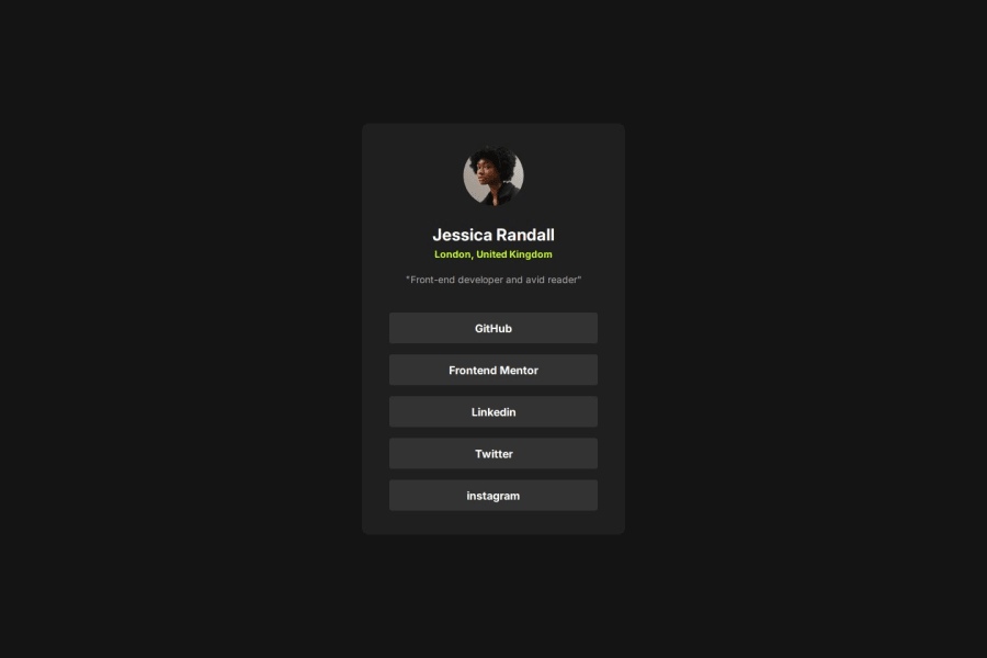
Design comparison
SolutionDesign
Solution retrospective
What challenges did you encounter, and how did you overcome them?
I had a lot of trouble with the links. Centering them correctly was easy, but making them look right was the trouble. Anytime I tried adding padding to them they would spill out of their container.
What specific areas of your project would you like help with?When there is many little sections of text like on this card is it beneficial to put them all in their own divs?
Community feedback
Please log in to post a comment
Log in with GitHubJoin our Discord community
Join thousands of Frontend Mentor community members taking the challenges, sharing resources, helping each other, and chatting about all things front-end!
Join our Discord
