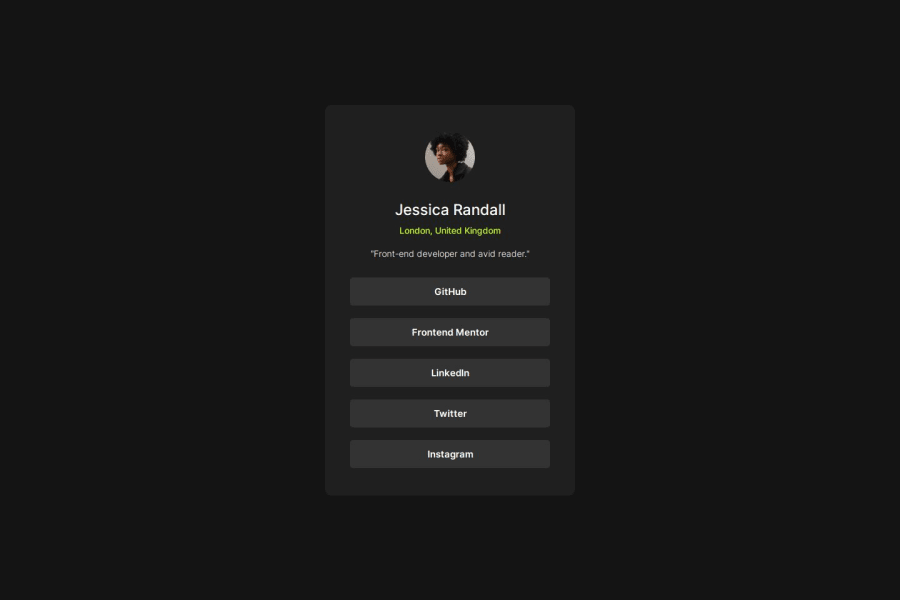
Design comparison
Solution retrospective
I'm most proud of the speed at which I was able to create this. I was struggling a lot with starting up CSS files and organizing them in a way to write less code, but I feel like I took a step towards the right direction when I finished this page. Next time I would like to be completely comfortable with flexbox manipulations as I still made mistakes and had to reiterate my usage of flexbox and padding/margins.
What challenges did you encounter, and how did you overcome them?The challenges I encountered had to do with not having exact measurements of pages. Since I had no figma file this time around, I had to simply eyeball the sizes and although I hope I created an identical page, I know that it might have some slight variations. Although not completely overcame, I did my best to compare the jpegs and my page side by side.
What specific areas of your project would you like help with?I would love help on the organization of my CSS file and to know if there are more efficient ways to stylize and format my page.
Community feedback
- @rahmani-codePosted 3 months ago
I suggest using semantic tags instead of overusing <div> elements. Additionally, it is better to save frequently used colors as variables for reuse. Overall, you’ve done a great job
0
Please log in to post a comment
Log in with GitHubJoin our Discord community
Join thousands of Frontend Mentor community members taking the challenges, sharing resources, helping each other, and chatting about all things front-end!
Join our Discord
