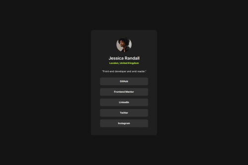
Submitted over 1 year agoA solution to the Social links profile challenge
Social Links Card HTML & Sass
sass/scss
@lenanle333

Solution retrospective
What are you most proud of, and what would you do differently next time?
Im most proud that I was able to complete the challlenge fairly fast after completing the prior challenges
What challenges did you encounter, and how did you overcome them?I did run into an issue where I nested a div with a class of "card" inside of a main tag and I wasn't able to render the card correctly. After removing the div and naming the main tag "card" I fixed the issue.
What specific areas of your project would you like help with?I don't necessarily need help, but any feedback would be great.
Code
Loading...
Please log in to post a comment
Log in with GitHubCommunity feedback
No feedback yet. Be the first to give feedback on Lena's solution.
Join our Discord community
Join thousands of Frontend Mentor community members taking the challenges, sharing resources, helping each other, and chatting about all things front-end!
Join our Discord