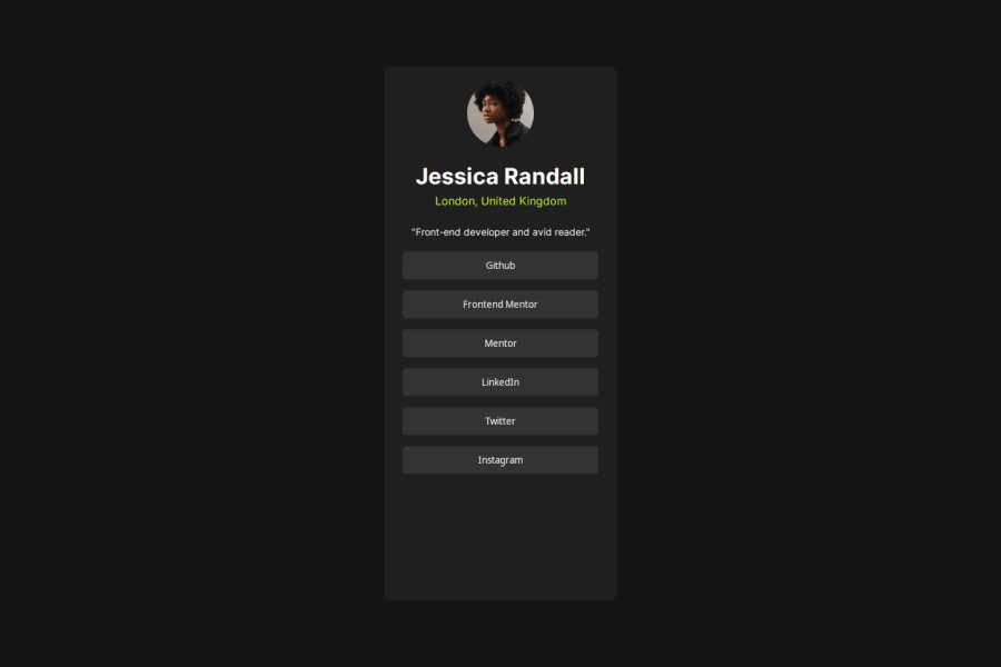
Design comparison
SolutionDesign
Solution retrospective
What are you most proud of, and what would you do differently next time?
Laying out the project first, then styling section by section
What challenges did you encounter, and how did you overcome them?I struggled with the buttons/links. I couldn't get the active state to work correctly. I moved the button tag inside of the anchor tag and readjusted the css.
What specific areas of your project would you like help with?How is the desktop design. I opted to go mobile first, but didn't change anything for the desktop version.f
Community feedback
Please log in to post a comment
Log in with GitHubJoin our Discord community
Join thousands of Frontend Mentor community members taking the challenges, sharing resources, helping each other, and chatting about all things front-end!
Join our Discord
