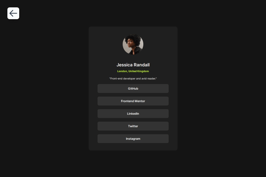
Design comparison
Solution retrospective
Once again, I really enjoyed the design and the color palette of the card and the hover effect was just *chef's kiss*. Nothing outstanding on the technical side, pretty simple project.
What challenges did you encounter, and how did you overcome them?It was my first project without Figma files, so I had to eyeball some spacings and font sizes and weights, but it turned out alright.
I had some trouble with setting the correct width and making it scale correctly, in the end I think it was just my monitor scaling up the page size and displaying 481 pixels (calculated in inspect tools in Firefox) as 601 pixels (measured by the ruler from Windows PowerToys).
What specific areas of your project would you like help with?Nothing in particular, though open to any feedback!
Community feedback
Please log in to post a comment
Log in with GitHubJoin our Discord community
Join thousands of Frontend Mentor community members taking the challenges, sharing resources, helping each other, and chatting about all things front-end!
Join our Discord
