

Design comparison
SolutionDesign

Solution retrospective
What are you most proud of, and what would you do differently next time?
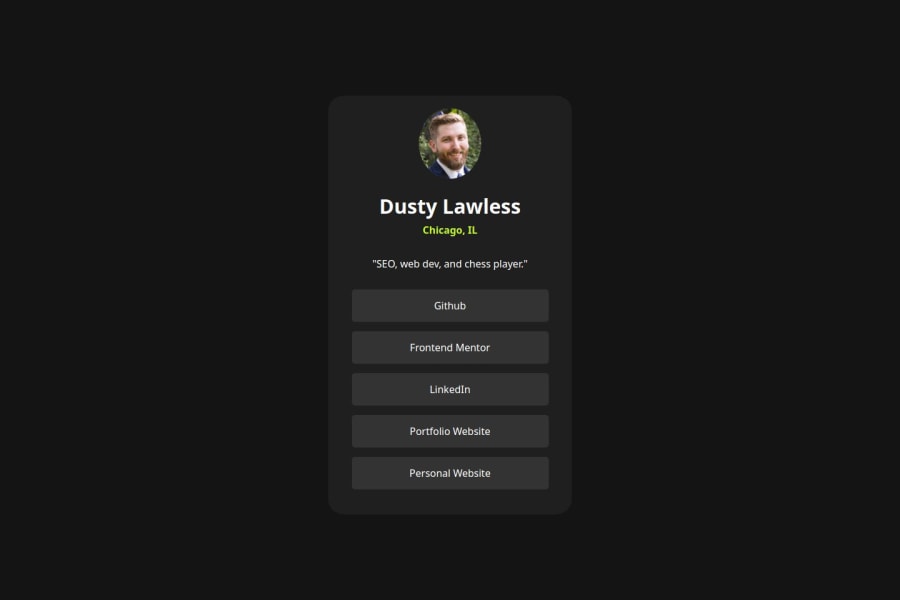
Most proud of how close it visually looks to the design. Need to figure out how to not do negative margins.
What challenges did you encounter, and how did you overcome them?Too much space between my name and city. I used a negative margin. Also applying the downloadable font.
What specific areas of your project would you like help with?How to properly reference the downloaded font.
Community feedback
- @BenjaminSiretPosted about 2 months ago
hi I see you took some liberties with the basic design. it's ok but some advice:
- respecting a design to the pixel can also be a good exercise
- your border radius are slightly different
- your hovers are cool! a transition would make the effect even nicer.
Good job!
Marked as helpful0


Please log in to post a comment
Log in with GitHubJoin our Discord community
Join thousands of Frontend Mentor community members taking the challenges, sharing resources, helping each other, and chatting about all things front-end!
Join our Discord