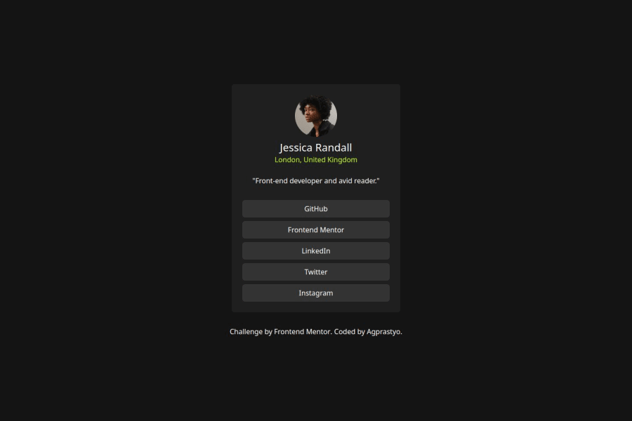
Design comparison
Please log in to post a comment
Log in with GitHubCommunity feedback
- P@Fable54321
I am not sure whate to think about this one, after seeing you have used react.
I feel like maybe you are trying to practice your react skills on some shorter project, wich is a good idea.
The use of the map function to create the links shows me you have good knowledge of more advanced concepts. Good job!
On the other end, it is crucial on these smaller projects that you try to be top notch on what might seems less advanced. This is what makes professionals, the ability of doing the simple things over and over again in a coherent manner.
You have your hover state for your links, shouldn't be too hard to make them the right color.
The use of the map function for the links is good, but you sould have still wrap it in something to have more control over it.
Overall good job, I might sound harsh on these point but it's because I can see you are not a beginner.
Marked as helpful
Join our Discord community
Join thousands of Frontend Mentor community members taking the challenges, sharing resources, helping each other, and chatting about all things front-end!
Join our Discord
