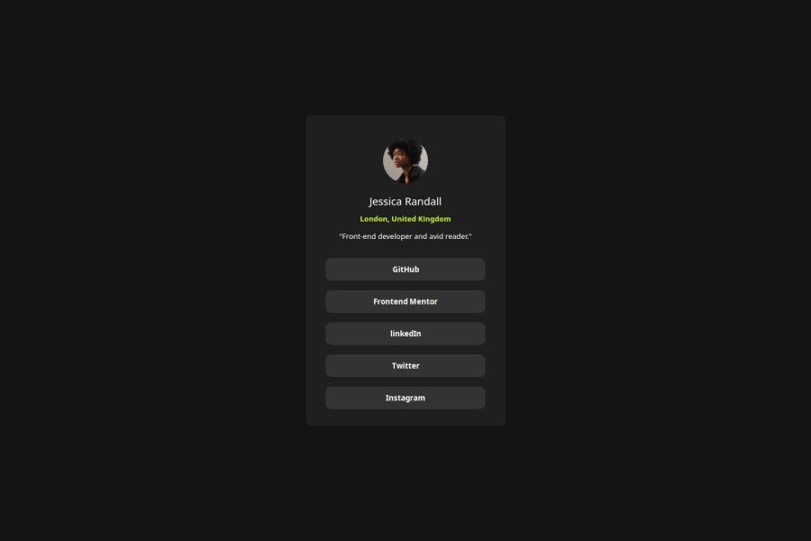
Design comparison
Solution retrospective
I take pride in my ability to address challenges that arise during development independently. Successfully overcoming obstacles through my efforts boosts my confidence and reinforces my expertise in troubleshooting and problem-solving within the project scope. This sense of accomplishment fuels my passion for continued learning and growth in web development.
What challenges did you encounter, and how did you overcome them?I encountered some minor bugs during the development process, but I could identify and resolve them effectively through careful examination and attention to detail. This hands-on troubleshooting experience enhanced my problem-solving skills and deepened my understanding of the project's intricacies.
What specific areas of your project would you like help with?I am open to receiving feedback and corrections as they provide valuable insights for improvement.
Community feedback
- @0xabdulkhaliqPosted 11 months ago
Hello there 👋. Congratulations on successfully completing the challenge! 🎉
- I have a suggestion regarding your code that I believe will be of great interest to you.
MAKING ACCESSIBLE LINKS:
- The links like
Github,Frontend Mentorare needed to be actual<a>elements which are wrapped up usingliandulelements. Thebuttonelement is not appropriate to use in this solution. becausebuttonelement can't be used for navigation purposes that's why we want to useaelements.
- This is the current markup,
<button> GitHub</button>
<button>Frontend Mentor</button>
 ....
- In order to make this solution accessible, we need to use
<a>elements withhrefattribute. Here's the example
<ul>
    <li>
       <a href="#">Github</a>
    </li>
    <li>
       <a href="#">Frontend Mentor</a>
     </li>
    ...
</ul>
....
- If you have any questions or need further clarification feel free to reach out to me.
.
I hope you find this helpful 😄 Above all, the solution you submitted is great !
Happy coding!
0 - P@danielmrz-devPosted 11 months ago
Hello there!
Congrats on completing the challenge! ✅
Your solution is really impressive!
I've got a couple of ideas (about how to use HTML better) that could make it even stronger:
📌 First: Think about using
<main>to wrap your main content instead of<div>.Imagine
<div>and<span>in HTML as basic containers. They're good for holding stuff, but they don't tell us much about what's inside or its purpose on the webpage.📌 Second: Don't skip heading levels – start with
<h1>, then use<h2>, and so on.It's more than just text size — it's about structuring your content effectively:
- The
<h1>to<h6>tags are used to define HTML headings. <h1>is for the most important heading.<h6>is for the least important heading.- Stick to just one
<h1>per page – it should be the main title for the whole page.
These tweaks might not change how your page looks, but they'll make your HTML code clearer and help with SEO and accessibility.
Hope that's helpful!
Keep up the great work!
0 - The
Please log in to post a comment
Log in with GitHubJoin our Discord community
Join thousands of Frontend Mentor community members taking the challenges, sharing resources, helping each other, and chatting about all things front-end!
Join our Discord
