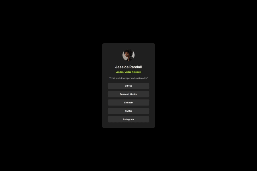
Design comparison
Solution retrospective
I am proud of my observation skill to get near the design that provided in the starter file.
I may not get exact solution but it is near the design that are provided.
What challenges did you encounter, and how did you overcome them?I faced the challenge while picking up the color.
Please log in to post a comment
Log in with GitHubCommunity feedback
- @wiseweb-works
I think the size difference is due to the fact that figma files are exclusive for PRO members. I think such differences are normal since we determine the sizes by eye. The only important difference that caught my eye is the body background color difference. It should not be exactly black but a color given in the style guide.
Other than that, it's pretty good.
Marked as helpful
Join our Discord community
Join thousands of Frontend Mentor community members taking the challenges, sharing resources, helping each other, and chatting about all things front-end!
Join our Discord
