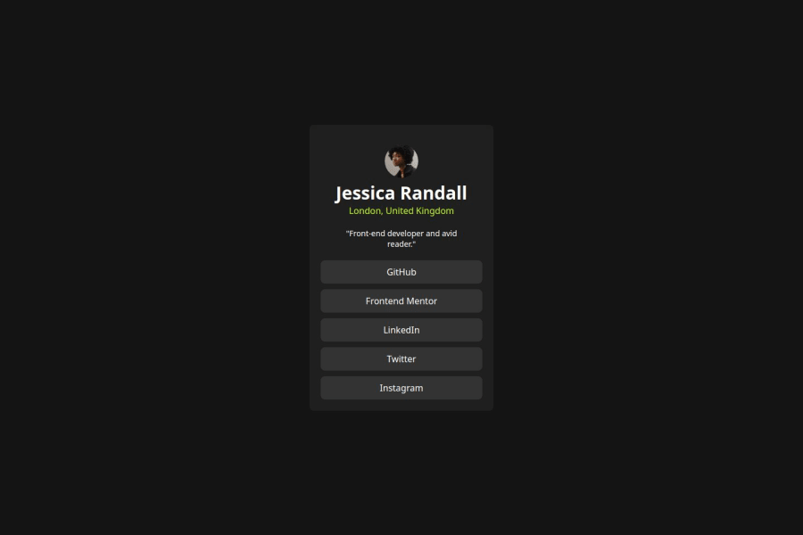
Design comparison
Solution retrospective
Da próxima vez quero me atentar a organizar mais o código.
What challenges did you encounter, and how did you overcome them?Encontrei desafio em acertar a cor da letra verde, mas fui atrás de ferramentas que conseguem definir para mim.
What specific areas of your project would you like help with?Gostaria do feedback geral onde posso melhorar.
Community feedback
- @cardozo309Posted 8 months ago
Não estou conseguindo compreender porque na minha solução parece está quebrado (os links estão saindo do card), mas quando abro o site do projeto esta normal.
0@LuisVera1Posted 8 months agoHi David!
The links were overflowing from the container because it had a fixed height:
.container{ background-color: #1F1F1F; text-align: center; width: 330px; height: 450px; /* <-- fixed height */ border-radius: 8px; }
but now, the container can grow with its content, still happens?, I haven't found this problem again.
Hope that's helpful, If it is, don't forget to mark it, thank you
Marked as helpful0 - @LuisVera1Posted 8 months ago
Hey David
Your solution looks great! To improve the semantics of your HTML, here are some suggestions
--- Use the appropriate HTML element
- Use the
<main>
to wrap all the content instead a<div>
element - Use
<a>
for the links, for example, replace
<div class="link">GitHub</div>
to
<a class="link">GitHub</a>
--- Css
- To center the card you could use flexbox
display: flex; justify-content: center; align-items: center;
You can center an element with margin, but only for the horizontal center. Finally, the green color is
hsl(75, 94%, 57%)
, which you can find in the style-guide.md file.Check out the following link: social-links
Hope that's helpful!
Keep the good work!
0@cardozo309Posted 8 months ago@LuisVera1 This link you sent really surprised me, it's really good for testing and studying.
0 - Use the
- @sousallePosted 8 months ago
Boa noite cardozo, Como vai?
Bem na pasta que o front-end disponibiliza tem style-guild nele tem todas as informações que você precisa como as cores que você vai utilizar, fonts, tamanhos durante o projeto.
Pro código ficar melhor tente colocar um widht e um height para aumentar o fundo do projeto, pra você que está começando recomendo o curso de HTML5 e CSS3 do professor Gustavo Guanabara além de referencias bibliográficas como: MDN e W3school
0@cardozo309Posted 8 months ago@Ale04-git, muito obrigado pela dica. Estou fazendo sim o Curso do mestre Guanabara, porém também estou fazendo o da OneBitCode, nele encontrei mais exercícios embora o do mestre Guanabara esta mais atualizado.
0
Please log in to post a comment
Log in with GitHubJoin our Discord community
Join thousands of Frontend Mentor community members taking the challenges, sharing resources, helping each other, and chatting about all things front-end!
Join our Discord