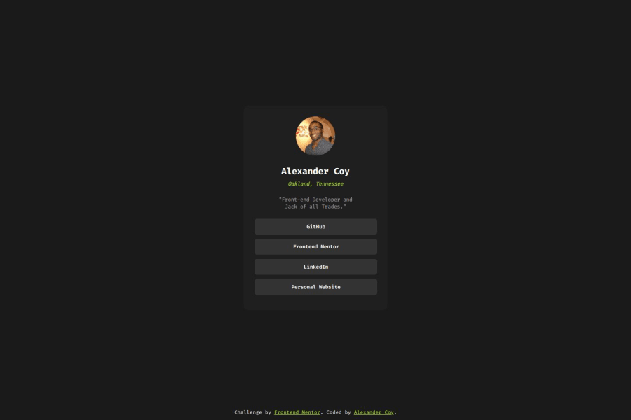
Design comparison
SolutionDesign
Solution retrospective
The hardest part of this project was dealing with the buttons, but it wasn't too difficult. Each time I do a project, I try to add something I haven't done before and make a habit of following more best practices. So, after publishing my work online, I decided to run it through Lighthouse. That made me realize I needed to tweak my code so it would be more syntactical.
Also, if you're not familiar with using clip paths to make a picture round, a super helpful site is https://bennettfeely.com/clippy/. Or, you could always change it in a picture editor like Figma.
Community feedback
Please log in to post a comment
Log in with GitHubJoin our Discord community
Join thousands of Frontend Mentor community members taking the challenges, sharing resources, helping each other, and chatting about all things front-end!
Join our Discord
