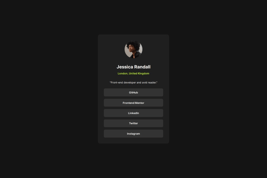
Design comparison
Solution retrospective
Well, I was able to complete the project without any difficulty. Finally, I felt like I knew everything well.
What challenges did you encounter, and how did you overcome them?Choosing how to cover the items, delegating them into containers caused me some confusion. Like I could create just one container for the author info part but at the end decided to divide it into 3 parts. I would love to get some advice on compartmentalizing the project correctly or reasonably.
What specific areas of your project would you like help with?I think the design looks fun but I am not sure if I fully followed code writing conventions.
Community feedback
- @CHarvey820Posted 8 months ago
I think this is a fantastic solution, excellent work!
If I were to change anything it would just be a few naming conventions and alt text.
-
Naming conventions should be used to make it as easy as possible for the developer to understand what sort of element it is referring to, while also being broad enough to cover the scope of the project's use cases. For example, your .hobbies class describes what the user wrote in this instance, but another user may write something different, it also does not inform a developer what that element is. Using phrases like "description" or "bio" in this instance would fill a larger use case, and be more useful to the developer. The #yellow-text id is also a bit misleading (in this instance the text is actually green!) and doesn't otherwise describe what that element is. Placing it inside your heading div makes it clear that this is another heading, but something like "location" would be more specific on what that header is used for.
-
Alt text is best used as a quite literal description of the image, so something like "avatar of author Jessica Randall" would help convey more information to users using screen readers.
I think your code looks great overall, but going above and beyond to assist your fellow developers and users with accessibility needs will really make your projects shine!
Marked as helpful1 -
Please log in to post a comment
Log in with GitHubJoin our Discord community
Join thousands of Frontend Mentor community members taking the challenges, sharing resources, helping each other, and chatting about all things front-end!
Join our Discord