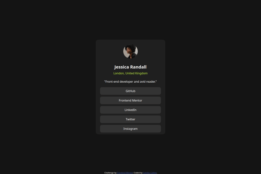
Design comparison
Solution retrospective
Making the design responsive and organised is something I'm really proud of.
What challenges did you encounter, and how did you overcome them?My only challenge was not being able to get the design details from figma.
What specific areas of your project would you like help with?For this challenge I don't have any problem.
Community feedback
- @AdrianoEscarabotePosted 6 months ago
Hi collins-ai, hope you're doing well! I loved how your project turned out, but I’ve got a few suggestions that could be useful:
A tip to improve the semantics of the code would be to use ul, since that is a list of links:
<ul>
    <li><a href="#">GitHub</a></li>
    <li><a href="#">Frontend Mentor</a></li>
    <li><a href="#">LinkedIn</a></li>
    <li><a href="#">Twitter</a></li>
    <li><a href="#">Instagram</a></li>
</ul>
The rest is fantastic.
Hopefully, you'll find it helpful. 👍
Marked as helpful0@collins-aiPosted 6 months ago@AdrianoEscarabote Thanks a lot for the tip, i'll keep that in mind.
1 - @Ttyn08Posted 6 months ago
-The solution include semantic HTML
- It is accessible.
Marked as helpful0
Please log in to post a comment
Log in with GitHubJoin our Discord community
Join thousands of Frontend Mentor community members taking the challenges, sharing resources, helping each other, and chatting about all things front-end!
Join our Discord
