

Design comparison

Community feedback
- P@hongleir2Posted 2 months ago
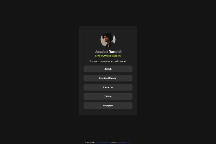
Great job on this implementation! 🎉 Your solution is very close to the design, achieving an almost pixel-perfect match. The layout, typography, and structure are well-executed, making it a clean and responsive implementation.
Just a couple of minor differences:
The gap between Jessica’s name and location is slightly off compared to the design. A small adjustment in spacing (e.g., gap or margin) should help match it more closely. The avatar size differs slightly from the original. Ensuring the correct dimensions (width and height) will bring it even closer to the intended design. Overall, a solid implementation with great attention to detail! Keep up the great work! 🚀💡 Looking forward to your future projects! 😊
Marked as helpful0@FA23BCS233Posted 2 months ago@hongleir2 Thanks for your recommendations I will try to fix up the addressed issues.
0

Please log in to post a comment
Log in with GitHubJoin our Discord community
Join thousands of Frontend Mentor community members taking the challenges, sharing resources, helping each other, and chatting about all things front-end!
Join our Discord