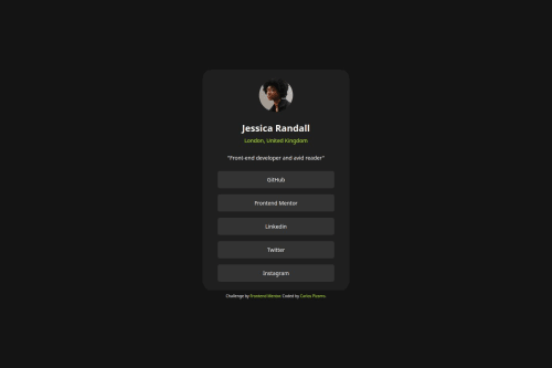
Design comparison
Solution retrospective
After several attempts, I learned how to use fluid sizing for padding.
What challenges did you encounter, and how did you overcome them?Initially, I thought it was a little different from fluid typography, but in the end, I found that it works pretty similarly.
What specific areas of your project would you like help with?I'm open for reviews and suggestions.
Community feedback
- @danielmrz-devPosted 4 months ago
Hello there!
Congrats on completing the challenge! โ
Your solution looks great!
๐ It's recommended to use semantic HTML elements like
<ul>
and<li>
for creating lists. This ensures that your code is more accessible, maintainable, and semantically meaningful.Here's and example on how you can refactor your code:
After Refactoring
<ul class="list-container"> <li><a href="#">Github</a></li> <li><a href="#">Frontend Mentor</a></li> <li><a href="#">LinkedIn</a></li> ... </ul>
By using
<ul>
and<li>
, you convey the structure of your content more clearly, making it easier for screen readers and search engines to understand. Additionally, it aligns with best practices for HTML semantics.I hope you find this helpful!
Keep up the excellent work!
Marked as helpful0@IncorrigibleSpiritPosted 4 months agoOlรก @danielmrz-dev,
Thank you for your time and for checking my code in detail! I highly appreciate your comments and suggestions. I definitely need to pay more attention to these details to ensure, as you said, that my code will be more accessible, maintainable, and semantically meaningful.
Muito obrigado!
1 - @DylandeBruijnPosted 4 months ago
Hiya @IncorrigibleSpirit,
Great job on a good looking solution to this project! Happy to hear that you were able to use fluid sizing for padding and typography. I like the animations you added!
A bit of friendly constructive feedback:
-
I suggest adding some
padding
to thebody
element so the card has some spacing on smaller viewports. -
At the moment your card is not centered on larger viewports. I suggest changing the styling of your
body
element:
body { /* width: 100%; */ font-family: "Inter", sans-serif; /* min-width: 23.4375rem; */ /* max-width: 90rem; */ background-color: hsl(0, 0%, 8%); }
I commented out the lines that you could remove.
body
is a block element and by default haswidth: auto
which does the same aswidth: 100%
. Themin-width
andmax-width
prevent you from centering your card.- You could try using CSS variables to make your values more reusable. Like the colors or font family.
I hope you find my feedback helpful and I would appreciate it if you could mark it as helpful if it did!
Happy coding!
Marked as helpful0@IncorrigibleSpiritPosted 4 months agoHi @DylandeBruijn, Thank you for your valuable comments and suggestions. They are really useful. I didn't know these details about the body and its centering process.
Happy Coding!
1 -
- @DylandeBruijnPosted 4 months ago
Hiya @IncorrigibleSpirit,
I'm glad I could be of help!
0
Please log in to post a comment
Log in with GitHubJoin our Discord community
Join thousands of Frontend Mentor community members taking the challenges, sharing resources, helping each other, and chatting about all things front-end!
Join our Discord