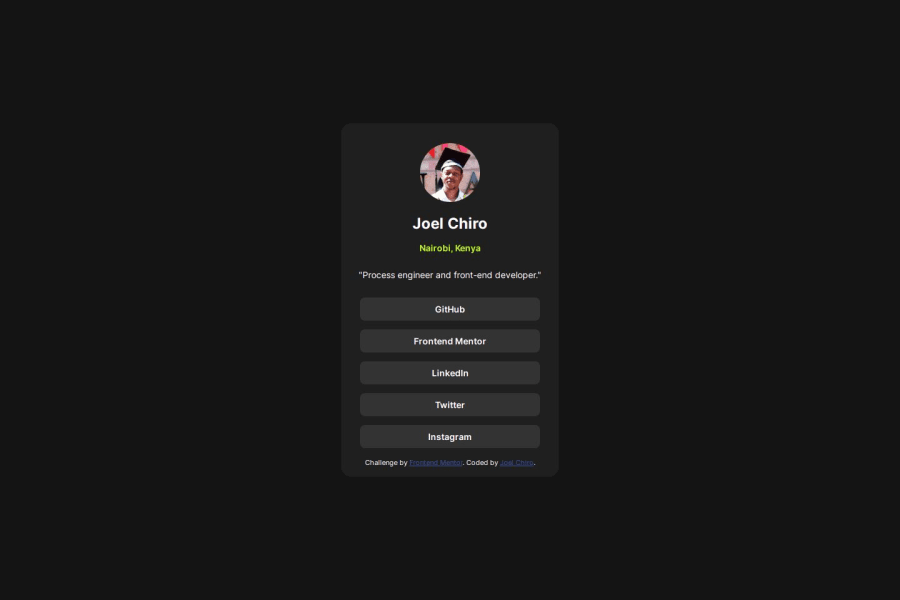
Design comparison
Solution retrospective
I am finally getting a grasp on flexbox, being able to manipulate items effectively. I am proud that I was able to include transitions in my project to make it more engaging and responsive
What challenges did you encounter, and how did you overcome them?This one was quite easy, thanks to the practice gained from the first two.
What specific areas of your project would you like help with?I am still asking for some help with mobile first workflow. My websites function well on a desktop but it is a different experience on a smaller screen.
Community feedback
- @R3ygoskiPosted 12 months ago
Hello Joel, congrats for finishing this challenge.
About your doubt with mobile-first, I honestly did not understand what you mean, can you explain a little bit with more details so I can help you? And for me it's working fine in smaller screen, I test it in 320px, and it's not bad.
And a hint, when you are using font-size, I highly recommend to use rem units, because they can adapt to user font size configuration, what gives more accessibility.
Another hint, but now about HTML, your
<div class="container">could be the<main>tag, because it's the main content of your page.And again, good job and congratulations, your project it's really good.
Marked as helpful0@1deadjoePosted 12 months agoHello @R3ygoski. Thanks a lot for the feedback. I will be sure to look into using rem units. My issue was just about ensuring my web page is also diplaying smoothly on phones or smaller screens.
1
Please log in to post a comment
Log in with GitHubJoin our Discord community
Join thousands of Frontend Mentor community members taking the challenges, sharing resources, helping each other, and chatting about all things front-end!
Join our Discord
