Design comparison
Community feedback
- @DAJ350Posted 7 months ago
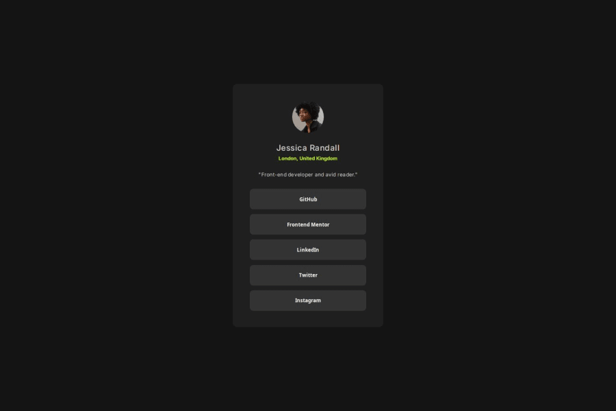
Hey, great work getting your page as close as you did to the inital design! I also noticed your use of box shadow and transitions which gives the buttons a nice feel to them 👍.
I did notice however that the size of the card does not respond to the screen / viewport width. I'd recommend using a responsive design technique such as media queries or clamp to achieve such a responsive design.
Here is a resource you can use to learn about responsive design:
URL: https://developer.mozilla.org/en-US/docs/Learn/CSS/CSS_layout/Responsive_Design
Why It's Great: MDN provides thorough, well-documented guides on the fundamentals of responsive web design. It covers the core concepts such as media queries, flexible grid layouts, and responsive images.
Marked as helpful1@arpan62825Posted 7 months ago@DAJ350 Hey! Thanks for the tips and resources, will surely make use of them in future projects 🚀
Happy Coding! 😊
0 - P@StroudyPosted 7 months ago
Hey, fantastic effort on this! You’re really nailing it. Just a few things I noticed that could make it even better…
-
Using a
<main>tag inside the<body>of your HTML is a best practice because it clearly identifies the main content of your page. This helps with accessibility and improves how search engines understand your content. -
I would put these into a
<ul> <li>, and the text should be wrapped with a<a>so it is accessible with a keyboard using the tab key, Using an<a>tag for navigation is semantically correct, improves accessibility for screen readers, and ensures consistent behavior across browsers, unlike a<button>or a<div>not intended for links.
<div class="social-links"> <button>GitHub</button> <button>Frontend Mentor</button> <button>LinkedIn</button> <button>Twitter</button> <button>Instagram</button> </div>-
Using
position: absoluteis not always best practice because it removes elements from the normal document flow, making layouts harder to manage and potentially causing overlap or misalignment on different screen sizes. Instead, use flexible layout techniques like CSS Grid or Flexbox for more responsive and maintainable designs. -
For future project, You could downloading and host your own fonts using
@font-faceimproves website performance by reducing external requests, provides more control over font usage, ensures consistency across browsers, enhances offline availability, and avoids potential issues if third-party font services become unavailable. Place to get .woff2 fonts
I hope you found this advice helpful! Keep up the great work, and don’t forget to dive deeper into the details. You’re doing amazing, and I can’t wait to see what you create next. Happy coding! 🚀
Marked as helpful0@arpan62825Posted 7 months ago@Stroudy Hey! Just wanted to say a huge thank you for taking the time to review my project. Your feedback is super helpful and I really appreciate the insights you shared!
I’m excited to apply your suggestions and improve my work. Thanks again for the encouragement and great advice – it means a lot! 🚀
Happy coding! 😊
1P@StroudyPosted 7 months agoHey @arpan62825, No problem, I encourage you to do code reviews aswell and you can compare your own solution and see different results, It is apart of the learning journey. You got this bro!
1 -
- @ErysnellPosted 7 months ago
I would recommend that instead of buttons you use links(<a>), so you can use your real links, as an extra option is to customize it to your profile.
0
Please log in to post a comment
Log in with GitHubJoin our Discord community
Join thousands of Frontend Mentor community members taking the challenges, sharing resources, helping each other, and chatting about all things front-end!
Join our Discord
