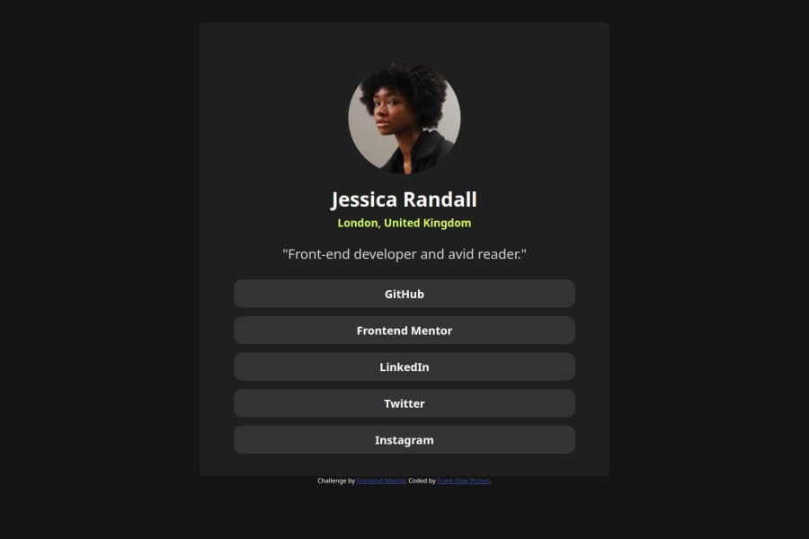
Design comparison
SolutionDesign
Community feedback
- @MarGuc1Posted about 2 months ago
Looking for an easy way to make your card responsive? Try this:
.card {
  width: 90%;
  max-width: 37.5rem;
}
On smaller screens, the card will be 90% wide, but it will stay fixed at 37.5rem (600px) once it reaches that size.
To center the card, use this code:
.container {
  display: grid;
  place-items: center;
}
Hope this tip helps! 💗💗💗
Keep up the fantastic work! 😁😊😉
0
Please log in to post a comment
Log in with GitHubJoin our Discord community
Join thousands of Frontend Mentor community members taking the challenges, sharing resources, helping each other, and chatting about all things front-end!
Join our Discord
