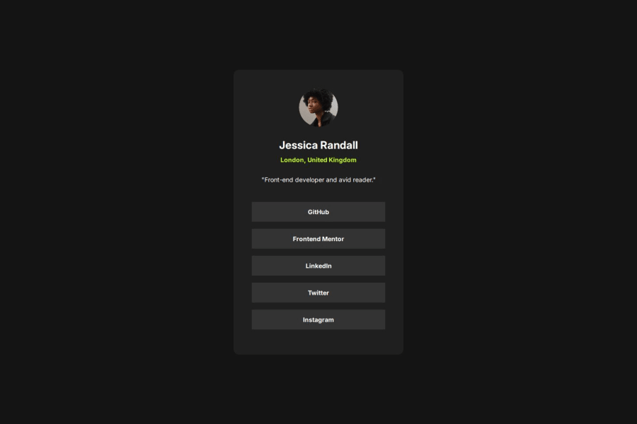
Social Link Profile Solution using HTML and CSS
Design comparison
Solution retrospective
Proud of Learning about:
- New ways to reset css styles
- Adding better alt text for images
- followed proper set of units for width,fonts.
Encountered challenge with creating media queries for different screen sizes
What specific areas of your project would you like help with?Please go through my project and let me know on the areas that I can improve.
Community feedback
- @AdrianoEscarabotePosted 5 months ago
Hi Lokesh, how are you doing? I really loved the outcome of your project, but I have a few suggestions that I think might be helpful:
To enhance the semantics of your code, consider using a
<ul>(unordered list) for the collection of links, as it represents a list of related items. Here's an example:<ul> <li><a href="#">GitHub</a></li> <li><a href="#">Frontend Mentor</a></li> <li><a href="#">LinkedIn</a></li> <li><a href="#">Twitter</a></li> <li><a href="#">Instagram</a></li> </ul>Using a
<ul>provides clear structure and context, signaling to both browsers and assistive technologies that these links are part of a cohesive group, improving both accessibility and readability.The rest is excellent.
I hope you find it useful. 👍
Marked as helpful0@Lokesh8055Posted 5 months ago@AdrianoEscarabote , Thank you for the suggestion I have made the changes
1
Please log in to post a comment
Log in with GitHubJoin our Discord community
Join thousands of Frontend Mentor community members taking the challenges, sharing resources, helping each other, and chatting about all things front-end!
Join our Discord
