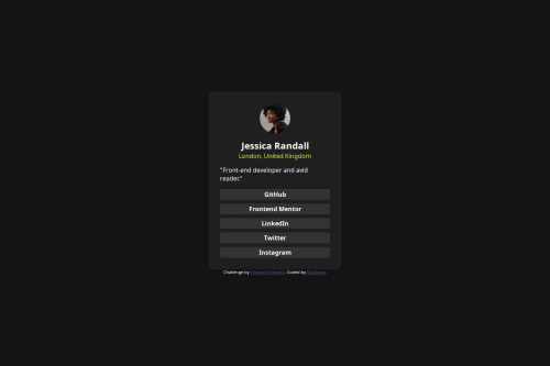
Design comparison
Solution retrospective
I didn't know that I can use 100% height with html tag to center the card. I guess it become a little easier than before.
What challenges did you encounter, and how did you overcome them?It took me almost an hour to finish. I think I need to practice more.
What specific areas of your project would you like help with?I always have trouble with deciding the width and height of the card. I don't know what percentage it should be.
And if there is any advice you want to give me, warmly welcome.
Community feedback
- @MadArtistPhotoPosted 4 months ago
Trying to match all the measurements can be quite a challenge. I have added two tools to my arsenal. First- a Graphics Program that will display an image at 100% (Faststone Image Viewer works). Second- PicPick, an image accessory program. PicPick has a ruler you can use on screen where you are viewing the Design Image provided with the challenge. This allows you to measure everything, the card size, spacing between elements, spaces that would be margins or padding, etc. This makes it a lot easier than trying to guess the dimensions.
Marked as helpful1@Mystique9901Posted 4 months ago@MadArtistPhoto I am not quite familiar with fastston and PicPick. I will check it out. And Thank you for your advice.
0 - @JEWebDevPosted 4 months ago
Hello @Mystique9901!
Nice job! Here are some tips i think could help:
- Start with mobile design first, it will make it a lot easier to code, give it a try and see how it goes. I recommend this to you because that way you don't have to give the card a width or height, if you start with mobile first you just need to give the body a padding and center the card horizontally, like this:
body{ min-height: 100dvh; padding: 1.5rem 0; display: flex; flex-direction: column; justify-content: center; }
This way you will have the card at the right size from the start, if you want it to grow a bit or not grow at all you can give the card a
max-width
property, like this:.card{ max-width: 25rem; {
That way it will grow if there is space but only up to 25rem or the value you want.
- Instead of using
height: 100%
usemin-height:100dvh
In this challenge the page only has one section but in a multi-section page (header, hero, about, footer)height: 100%
will cut the rest of the sections because it won't grow with it's content.
If you need more help feel free to reach out! i will answer your questions the best i can.
If you find my reply useful please mark it as useful.
Marked as helpful0 - @Bamo-D-AbdallahPosted 4 months ago
Block level elements have 100% width by default and I don't overwrite that, instead I use
@media (min-width: some_screen_size)
then inside it I will set max size the width can get for bigger screen sizes and always userem
:@media (min-width: 35rem) { .card { max-width: 15rem; } } @media (min-width: 45rem) { .card { max-width: 18rem; } }
Never use
height
,min-height
, andmax-height
on elements, it is the job of the browser desige what height they should have based on their content.Also you can give the links and the card itself some padding to make them more readable and look better.
Marked as helpful0@Mystique9901Posted 4 months ago@Bamo-D-Abdallah I wasn't really familiar with rem , and I rarely use it before. And Thank you for your advice. I will be more careful about it.
0
Please log in to post a comment
Log in with GitHubJoin our Discord community
Join thousands of Frontend Mentor community members taking the challenges, sharing resources, helping each other, and chatting about all things front-end!
Join our Discord