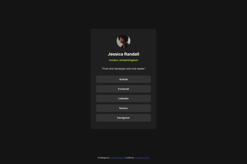
Submitted over 1 year agoA solution to the Social links profile challenge
Social Link Profile - Project

@LorenzoSerra1
Solution retrospective
What are you most proud of, and what would you do differently next time?
I realize that I'm getting better at running and writing code in terms of speed
What challenges did you encounter, and how did you overcome them?The biggest challenge was finishing the project by perfecting the details
What specific areas of your project would you like help with?I would like to improve on the latest revisions of the project, to understand if my work is valid or not
Code
Loading...
Please log in to post a comment
Log in with GitHubCommunity feedback
No feedback yet. Be the first to give feedback on LorenzoSerra1's solution.
Join our Discord community
Join thousands of Frontend Mentor community members taking the challenges, sharing resources, helping each other, and chatting about all things front-end!
Join our Discord