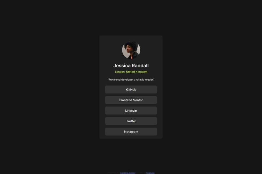
Design comparison
Solution retrospective
This project is pretty similar to the previous 2, so I don't feel that I learned very much. The muscle memory is nice though.
What challenges did you encounter, and how did you overcome them?I had to play around with the anchor elements within the button divs to get full working space of the clicking area. I believe I had to remove the padding from the div and assign it to the anchor instead.
Community feedback
- @Alex-Archer-IPosted 5 months ago
Hi!
Good work, well done =)
But there are a couple of things that might be improved. Every time you encounter some kind of list you should use
uloroltags withliinside it. This is a list of links, so it could look like this:<ul> <li><a href="#">Link's text</a></li> <li><a href="#">Link's text</a></li> <li><a href="#">Link's text</a></li> <li><a href="#">Link's text</a></li> <li><a href="#">Link's text</a></li> </ul>Also try to use
remvalues for font sizes instead pixels. It's a special value which depends on user's font settings, so they provide better user experience. By default1rem = 16px.Hope that helps. Good luck, keep doing =)
Marked as helpful1
Please log in to post a comment
Log in with GitHubJoin our Discord community
Join thousands of Frontend Mentor community members taking the challenges, sharing resources, helping each other, and chatting about all things front-end!
Join our Discord
