Design comparison
Community feedback
- @Ramon-AlvezPosted 29 days ago
Congratulations on completing the challenge! I thought he was well done. Some tips that may be useful:
-
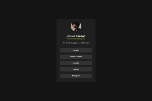
Card centering - to maintain responsiveness in all resolutions, do not limit the body's max-width to a specific value, leave it at 100% and it will center in any resolution. (my monitor has a resolution higher than 1440px and that's why the card was shifted to the left)
-
Links containers without links - missing the <a> tag inside the divs, my suggestion to make it better (and more semantically) would be to use a nav + links or a nav + ul + li + links, this way you keep the code more " semantic".
Like:
<nav> <ul> <li><a href="#">Github</a></li> <li><a href="#">Frontend Mentor</a></li> <li><a href="#">LinkedIn</a></li> <li><a href="#">Twitter</a></li> <li><a href="#">Instagram</a></li> </ul> </nav>
Marked as helpful0@Abdullah-trialPosted 29 days agoThanks for the feedback, i really appreciate your constructive review@Ramon-Alvez
1 -
Please log in to post a comment
Log in with GitHubJoin our Discord community
Join thousands of Frontend Mentor community members taking the challenges, sharing resources, helping each other, and chatting about all things front-end!
Join our Discord