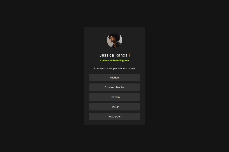
Social Link Profile Card using Vanilla HTML, CSS
Design comparison
Solution retrospective
I think I nailed the look of it. Especially the dimension of the card, it looks quite nice.
What challenges did you encounter, and how did you overcome them?The problem i think encountered was to measure the width of the card for the mobile version, then I used the paint.net app to measure it perfectly. I also created a media query to make the size adapt to look good.
What specific areas of your project would you like help with?I'd like some help with my CSS, I need to know if my choice of measuring unit was good or not. And if the card was nice to look at. Thank you!
Community feedback
- P@MikDra1Posted 5 months ago
Your units are well-written. The only thing that you need to remember is to always stick to rems. Only if the value is so small that it doesn't matter, something from 1px - 3px. 😉
Marked as helpful2 - @faizraeimPosted 5 months ago
You did a very good job there, only border-radius is missing a the container is a bit big. Updating those will end up with a prefect result.
1
Please log in to post a comment
Log in with GitHubJoin our Discord community
Join thousands of Frontend Mentor community members taking the challenges, sharing resources, helping each other, and chatting about all things front-end!
Join our Discord
