

Design comparison

Solution retrospective
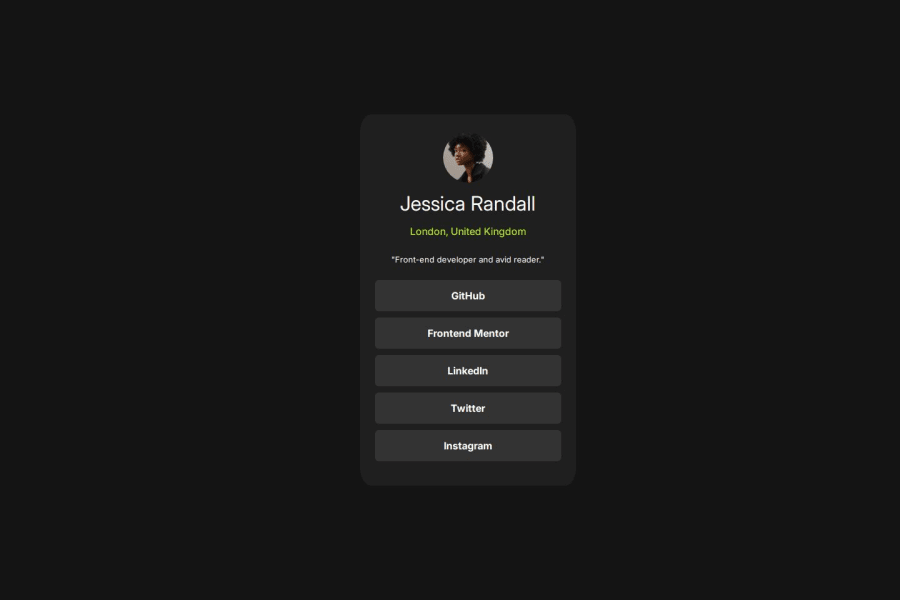
This project seemed to be a bit easier after doing the first earlier ones. Getting the hang of using css styling more. I would want to replicate this with tailwind as i don't want to lose that skill too.
What challenges did you encounter, and how did you overcome them?The image was giving me an issue and I was using flex-col styling causing it not to center. Figured it out though..
What specific areas of your project would you like help with?As always, sizing container took longer than expected and still can't visualize it quick enough that doesn't cause to frustrate me.
Community feedback
- @salahelec2Posted 5 months ago
I think the design rules are not met here. You have to change the border-radius of the buttons and the container to meet the specifications. Also, the buttons have to be centered inside the container, which is easy to do using Flexbox by setting:
display: flex; flex-direction: column; align-items: center; justify-content: center;on the container.Marked as helpful0

Please log in to post a comment
Log in with GitHubJoin our Discord community
Join thousands of Frontend Mentor community members taking the challenges, sharing resources, helping each other, and chatting about all things front-end!
Join our Discord