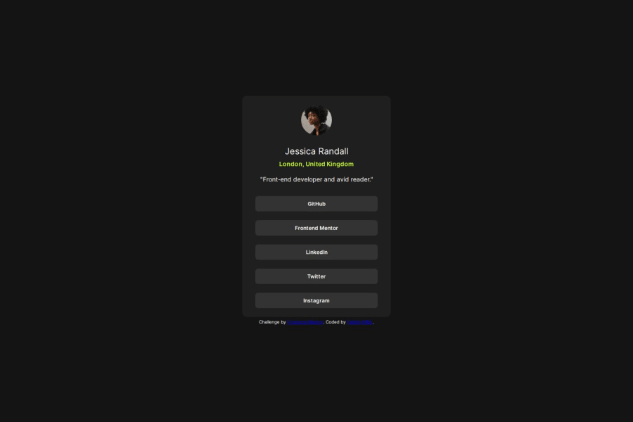
Design comparison
Solution retrospective
I am most proud of creating an elegant and functional profile card that showcases the user's social media links and personal information in a concise format. The dark theme with contrasting bright button highlights provides a modern aesthetic while ensuring excellent readability.
Next time, I would consider adding more interactivity to the design, such as hover effects on the profile picture or animations for the button presses. This could enhance user engagement and make the profile card more dynamic. Additionally, exploring responsive design techniques earlier in the process would ensure that the card adapts seamlessly across all device sizes.
What challenges did you encounter, and how did you overcome them?One significant challenge was designing a user interface that effectively balanced aesthetics and functionality. I had to ensure that the design was not only visually appealing but also intuitive and easy to navigate.
To overcome this, I focused on simplifying the layout by using a clear hierarchy of information and consistent styling for the buttons. I also conducted user testing to gather feedback on usability and made iterative improvements based on this feedback.
What specific areas of your project would you like help with?-
Design Improvement: I would like feedback on enhancing the visual appeal of the profile card without sacrificing usability.
-
Accessibility: Suggestions for improving accessibility, such as ensuring color contrasts meet accessibility standards or improving keyboard navigation, would be valuable.
-
Responsive Design: Advice on best practices for ensuring the profile card looks great on all screen sizes, particularly on small mobile devices.
-
Performance Optimization: Tips on optimizing the CSS and HTML for better performance, particularly regarding load times and responsiveness.
Community feedback
Please log in to post a comment
Log in with GitHubJoin our Discord community
Join thousands of Frontend Mentor community members taking the challenges, sharing resources, helping each other, and chatting about all things front-end!
Join our Discord
