Design comparison
Solution retrospective
It was a lot easier to do this one, and I felt more confident.
Please log in to post a comment
Log in with GitHubCommunity feedback
- @IsaacKel
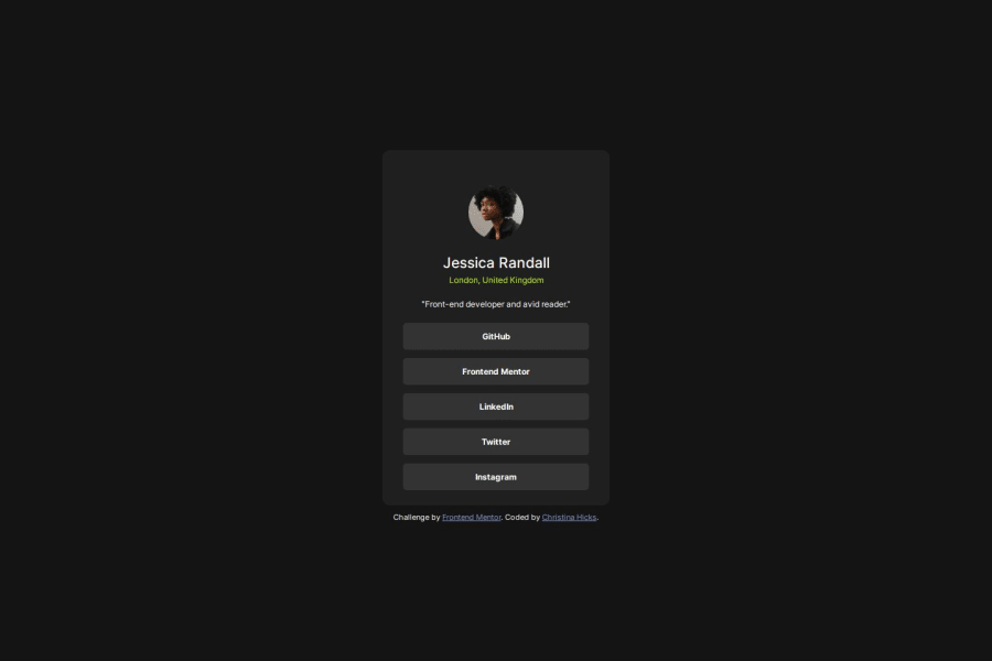
well done man, i believe reducing the padding/margins on the bottom would make it look cleaner :) can also reduce the opacity of the white text for the "Front-end developer and avid reader." part which will make it blend a bit better
- @PTN6389
Thank you for the input and suggestion on the opacity. I knew the text was different, but couldn't determine the difference.
Join our Discord community
Join thousands of Frontend Mentor community members taking the challenges, sharing resources, helping each other, and chatting about all things front-end!
Join our Discord
