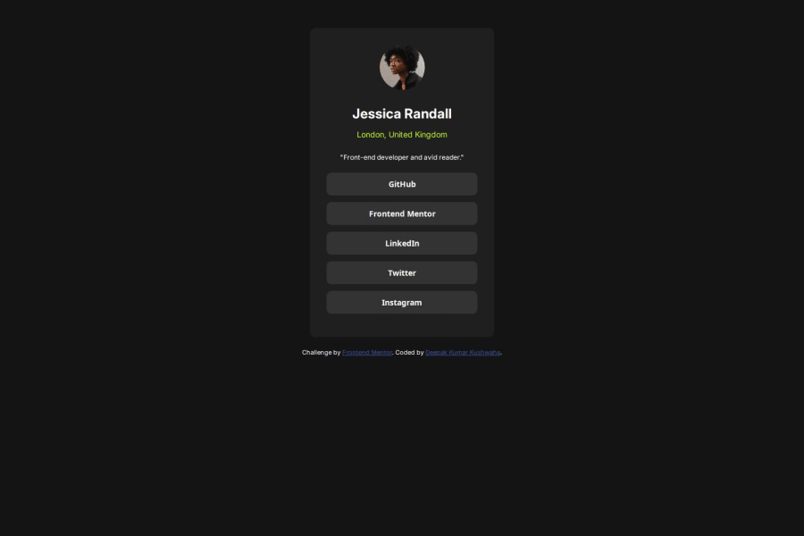
Design comparison
Community feedback
- @SvitlanaSuslenkovaPosted 7 months ago
body { display: flex; flex-direction: column; justify-content: center; align-items: center; min-height: 100vh; } Try this to align(top-bottom) and justify(left-right) your project to the center. It applies to the parent component(body), don't forget about !!min-height!!. You can use grid instead of flex too.
div profile-card should become <main>
it's not a mistake, but you can use your image as block (add class directly, display: block,...), that way you won't need a div for it.
Hope you found this comment helpful :)
Marked as helpful0@Deepak4511Posted 7 months agothanks for your suggestion your feedback is really helpful @SvitlanaSuslenkova
0
Please log in to post a comment
Log in with GitHubJoin our Discord community
Join thousands of Frontend Mentor community members taking the challenges, sharing resources, helping each other, and chatting about all things front-end!
Join our Discord
