


Design comparison


Solution retrospective
What are you most proud of, and what would you do differently next time?
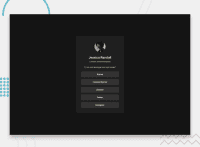
I am proud of how it looks at the end . I think its very close to how the design looks. I used a both flex to align the items in the container and use grid to create the layout.
What challenges did you encounter, and how did you overcome them?
As I didnt have the figma design, it was hard trying to guess the size of each elements and position them. Another issue I had was I didn't know how to position the 'links' (github, linkedin) etc. thats when I realised, i can mix between grid and flex.
What specific areas of your project would you like help with?
CSS, i would like to improve my CSS to my best ability and keep practicing. CSS is very confusing at some times and will need to practice more. I would like feedback on my CSS and areas I can Improve. And media queries to make it more responsive.
Community feedback
Please log in to post a comment
Log in with GitHub
Join our Discord community
Join thousands of Frontend Mentor community members taking the challenges, sharing resources, helping each other, and chatting about all things front-end!
Join our Discord