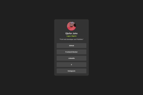
Submitted over 1 year agoA solution to the Social links profile challenge
social link profile 1st attempt
@echocode1

Solution retrospective
What are you most proud of, and what would you do differently next time?
I am proud of designing it even when I know it lacks a lot
What challenges did you encounter, and how did you overcome them?the colors giving seems a bit different from the starter designs i saw .had to generate some random color which took a whole lot of time
What specific areas of your project would you like help with?how to blend the mobile view to the desktop view though they look same to me.
Code
Loading...
Please log in to post a comment
Log in with GitHubCommunity feedback
No feedback yet. Be the first to give feedback on Ejiofor John's solution.
Join our Discord community
Join thousands of Frontend Mentor community members taking the challenges, sharing resources, helping each other, and chatting about all things front-end!
Join our Discord