Social Link Preview with Flexbox

Solution retrospective
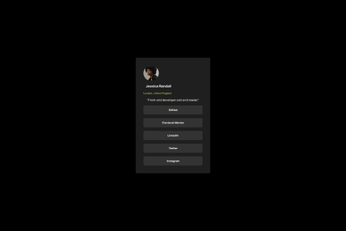
I think I'm getting a bit more comfortable with using flexbox and I'm happy about that. Definitely trying out grid css, tailwind, or even media queries for the responsive design
What challenges did you encounter, and how did you overcome them?I had a hard time with displaying the social links so it took me a while to figure out how to maximize the size of the links within the social link container.. I still get confused with using min-width and max-width. So i had to research on that. Mostly I had to keep going back to my basic knowledge on flexbox too.
What specific areas of your project would you like help with?Any feedback would really help when it comes to how I used flexbox since I'm still new with the whole concept :) I also think my code can be cleaner or more organized than this, so please feel free to let me know what i can improve on !
Please log in to post a comment
Log in with GitHubCommunity feedback
No feedback yet. Be the first to give feedback on Jas's solution.
Join our Discord community
Join thousands of Frontend Mentor community members taking the challenges, sharing resources, helping each other, and chatting about all things front-end!
Join our Discord