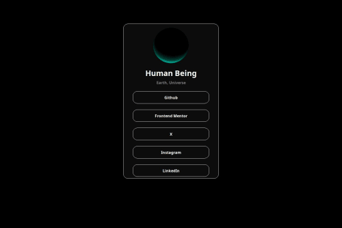
Social Link Page HTML & CSS

Solution retrospective
Super proud of the subtle ease in and out effect when hovering over the card.Not sure what I would do differently next time but I'm satisfied with how the final design came out. Update: I realized that I went completely off the rail compared to original. :/. forgive me!
What challenges did you encounter, and how did you overcome them?Encountered a super difficult challenge when moving the mouse away from the card. The transition was abrupt and ruined the overall experience of the effect. I overcame this issue by eating Ben and Jerry's Milk and Cookies ice cream after I finished I managed to unlock reality warping powers and achieved the smooth transition when moving the mouse away from the card.
What specific areas of your project would you like help with?:)
Please log in to post a comment
Log in with GitHubCommunity feedback
No feedback yet. Be the first to give feedback on univxrse's solution.
Join our Discord community
Join thousands of Frontend Mentor community members taking the challenges, sharing resources, helping each other, and chatting about all things front-end!
Join our Discord