Design comparison
Solution retrospective
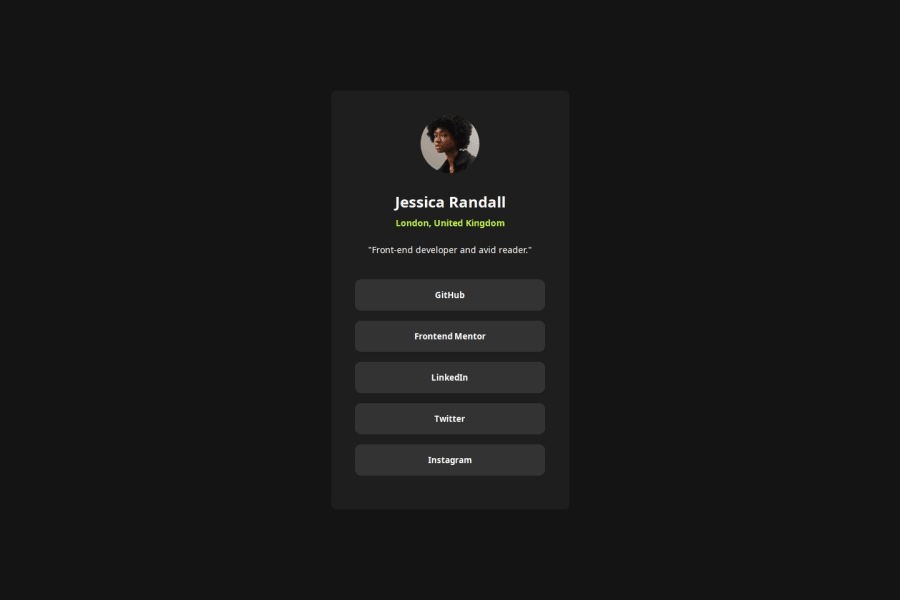
I'm proud of learning how to use CSS Variables. Also proud of figuring out how to make the width of child-divs dependent on their parent div's - (using the percentage-Value).
Another thing that i learned by reviewing somebody elses work here on FM is to use semantic html - i knew the principles of it already but wouldn't have thought of using it.
What challenges did you encounter, and how did you overcome them?I couldn't center my card directly so i had to find out why, turns out i still need to remind myself to use flexbox in the body element in css.
What specific areas of your project would you like help with?Hm, for this specific Componenten i think i'm good, but if you have something u think could be valuable to me dont hesitate to share :D
Community feedback
- @grace-snowPosted 6 months ago
Hi, I'm quite confused by the html on this. Where are you getting these elements from or where did you learn about them? (Like content, text etc).
I'd expect the html to be
- main landmark
- div for the card inside that
- img
- heading
- 2 paragraphs
- an unordered list with list items
- a link inside each item
It's particularly important to use links (anchors) for the links, not buttons. Anchors are for navigation.
This is also overflowing my screen at the top, in a way where I can't scroll to reach the overflowed content. The cause is the height 100% on both html and body. Remove that and instead use min-height 100svh on the body to make it at least as tall as the viewport.
1
Please log in to post a comment
Log in with GitHubJoin our Discord community
Join thousands of Frontend Mentor community members taking the challenges, sharing resources, helping each other, and chatting about all things front-end!
Join our Discord
