

Design comparison
SolutionDesign

Please log in to post a comment
Log in with GitHubCommunity feedback
- @Jewalikar-Nitin
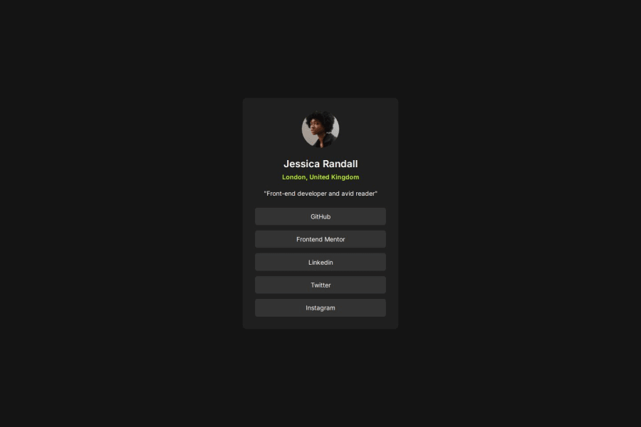
- Let's consider increasing the font-weight of link labels to make them bolder and more visually appealing.
- Adding more spacing to the top and bottom might provide better clarity for the card content and body.
- It looks like the GitHub repo might be set to private. If it's possible, making it public would allow us to check the code.
Marked as helpful

Join our Discord community
Join thousands of Frontend Mentor community members taking the challenges, sharing resources, helping each other, and chatting about all things front-end!
Join our Discord