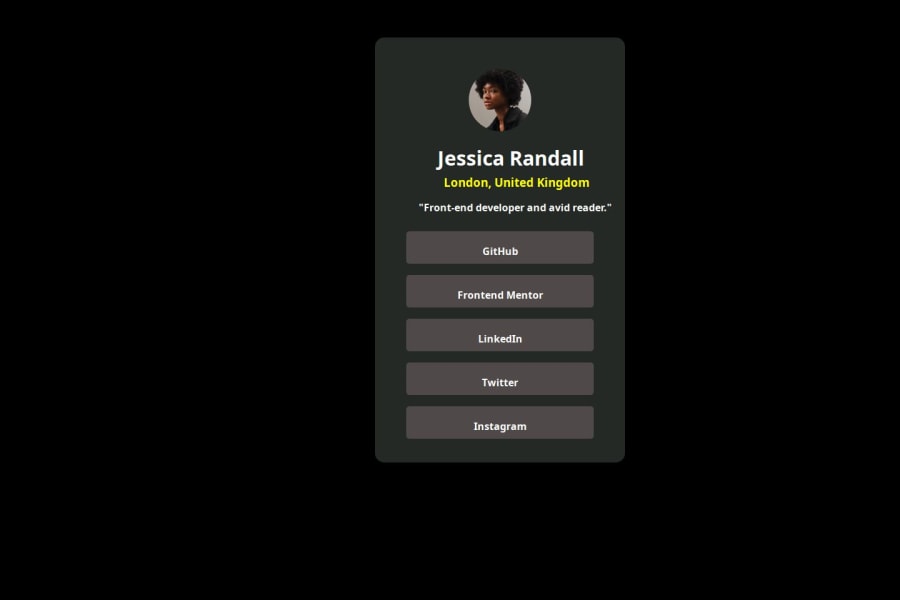


Design comparison

Community feedback
- @beowulf1958Posted 3 months ago
Your project looks great. However, the component sits in an awkward position on the screen due to the use of
  position: absolute;
  left: 600px;
  top: 60px;
A better way would be to remove this from the mother div and instead add to the body
  display: flex;
  flex-direction: column;
  align-items: center;
  justify-content: center;
  min-height: 100vh;
This will center the mother div no matter the screen size, making your project more responsive.
In general, the use of
position: absoluteto position things on the page is pretty old-fashioned. The more modern approach would be to use flexbox. Your next step is to go on youtube and learn how to do flexbox. It will make your life easier.Also, there is a lot of repetition in your code. Best practice is "don't repeat yourself." Whenever you repeat several lines, take them out and create a utility class. So, your one, two, three, four, five class all have
  color: white;
  background-color: rgb(79, 73, 73);
  height: 40px;
  width: 300px;
  border-radius: 5px;
  padding-bottom: 12px;
Pull this out and make a .link class and add that class to the one, two, three, four, five. So then you would have, for example
<div class="one link"><h4>GitHub</h4></div>This will reduce the number of lines you have to type and make your code more efficient and readable.
Hope this helps.
Marked as helpful0@GOWTA231Posted 3 months ago@beowulf1958 DEAR BEOWULF1958 THANK YOU SO MUCH FOR YOUR INVALUABLE FEEDBACK I HAVE LEARNED SO MUCH OF THINGS FROM YOUR FEEDBACK. I WILL SURE DON'T REPEAT THIS MISTAKE AND I WILL USE THE SUGESSION YOU HAVE GIVEN EFFECTIVELY. ONCE AGAIN THANK YOU SO MUCH FOR GIVING ME THE PERFECT WAY TO GET SUCCEED IN THIS PROJECT MASTER.
0

Please log in to post a comment
Log in with GitHub
Join our Discord community
Join thousands of Frontend Mentor community members taking the challenges, sharing resources, helping each other, and chatting about all things front-end!
Join our Discord