Submitted almost 4 years ago
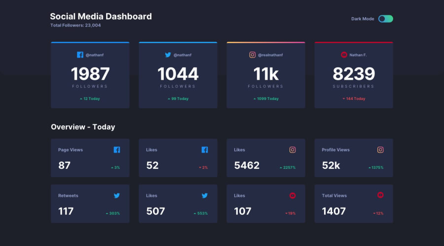
Social Dashboard with theme switcher using Scss and JavaScript
@IvanGH4
Design comparison
SolutionDesign
Solution retrospective
Any feedback is appreciated !!
Community feedback
- @SzymonRojekPosted almost 4 years ago
Hi Ivan
Well done.
I've just checked RWD in this project, a few tips:
- on mobile size check a size of the text Social Media Dashboard (it can get a different size), also the line after text total followers can get opacity (is too strong at the moment); I think you can increase a gap between boxes (first section);
- check the site by the inspector in your browser: after 740px you have got a broken layout. Example: starting from one column (mobiles), then for tablets you can set two rows (1 row has two boxes) and then desktop.
- you can give a transition to the cards too (witch the mode, you will see) so it will be smooth switching;
- check your accessibility issues report above and try to fix it.
That's it.
Greetings 🙂
2@IvanGH4Posted almost 4 years ago@SzymonRojek Thank you very much, this is really helpful! I will fix it right now :)
0
Please log in to post a comment
Log in with GitHubJoin our Discord community
Join thousands of Frontend Mentor community members taking the challenges, sharing resources, helping each other, and chatting about all things front-end!
Join our Discord
