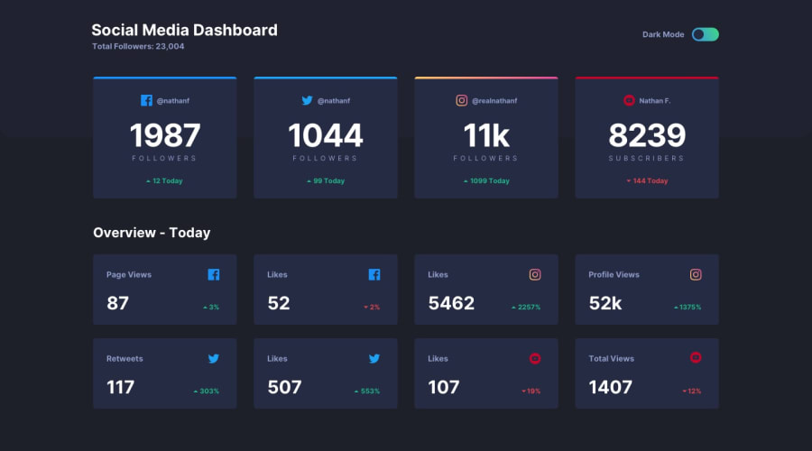
Design comparison
Solution retrospective
Would love to hear your feedbacks.
Community feedback
- @pikapikamartPosted over 3 years ago
Great work on this one but there are points where your cards right, not resizing properly and being cut of by the viewport's width and upon looking at your stylings, this was cause by the paddings of the top
.section-container, maybe you could add a breakpoint where there is a element being cut off so that you could avoid unwanted things like that.Another one is that the hover color right, when I hover on it especially on dark mode, the font colors is hard to see, maybe changing the hover background color and removing the opacity of it. Try maybe just a touch of background-color change. Adding also a
cursor: pointerin your toggle mode would be awesome^^1@GesierePosted over 3 years ago@pikamart thank u for your feedback yeah I thought reducing the opacity for the hover effect maybe I would see the text but not really, might recheck it and see what I have to do, forgot the cursor pointer for the toggle will do that thanks for the reminder.
0
Please log in to post a comment
Log in with GitHubJoin our Discord community
Join thousands of Frontend Mentor community members taking the challenges, sharing resources, helping each other, and chatting about all things front-end!
Join our Discord
