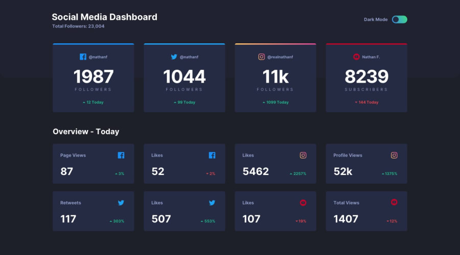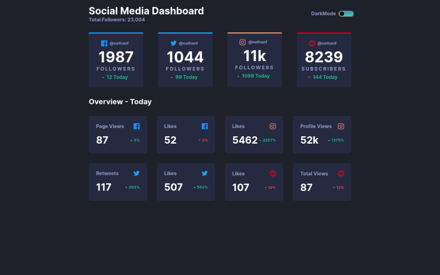
Social dashboard app with Theme switcher made using grid , flex JS
Design comparison
Solution retrospective
Feel free to point out my mistakes. your suggestions are more than welcome.
Community feedback
- @coderdanniePosted over 1 year ago
Hi. Congrats on the completion of this project. An extra features you can add is to store the themes state using browser localstorage so that your site can maintain the theme state even if the page was reload. Right now if I switch to light mode and reload the web page its switching back to the default theme. Using browser storage to store the theme and accessing the themes based on user preference will prevent this from happening. https://developer.mozilla.org/en-US/docs/Web/API/Window/localStorage
0@Vishesh-ShokeenPosted over 1 year ago@coderdannie thank you for your suggestion Daniel. i will surly work on it . if its not to much can you point out problems in my css . thanks
0@coderdanniePosted over 1 year ago@Vishesh-Shokeen Hi! I have to inspect your code and you really did a good job. Just improve more on your layout in terms of responsiveness. for example, while checking for responsiveness I noticed that you could have tried more to make the cards more responsive. The cards were on a stack order and they suddenly become rolls getting to the 800px breakpoint perhaps you could have made the cards behave in a certain way that is so flexible to take up available space in rolls format before getting to this breakpoint. It makes your cards too big. I used a grid for the layout of this project. The is .parent div for the cards { display: grid; --min-column-size: 225px; gap: clamp(1rem,5vmax,1.625rem); grid-template-columns: repeat(auto-fit, minmax(min(100%, var(--min-column-size)), 1fr)); } With these CSS rules, I was able to achieve perfect responsiveness without needing to set up media queries. This is my solution to the challenge https://coderdannie-darklight-toggle-page.netlify.app/ You can check for reference to my suggestion. To no know more about layout using grid and flex, you can check out the kelvin Powel youtube channel. I learned a lot and still learning from him. Overall you did a great job. Well done!
0@Vishesh-ShokeenPosted over 1 year ago@coderdannie Thank you so much for taking time out to check my project it really means a lot to me. even I was frustrated by the responsiveness of the cards. Kevin Powell is a great mentor i learned a lot from him as well. Thanks once again Daniel.
0@coderdanniePosted over 1 year ago@Vishesh-Shokeen you welcome. Perhaps we could follow each other. Thanks
0
Please log in to post a comment
Log in with GitHubJoin our Discord community
Join thousands of Frontend Mentor community members taking the challenges, sharing resources, helping each other, and chatting about all things front-end!
Join our Discord