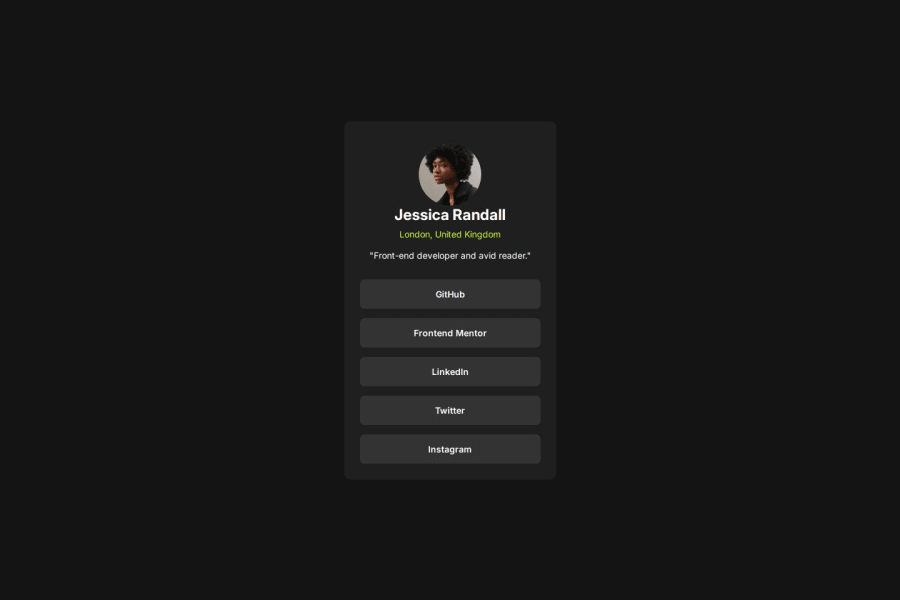
Design comparison
SolutionDesign
Solution retrospective
What are you most proud of, and what would you do differently next time?
I am proud of finishing this challenge without much stressing.
What challenges did you encounter, and how did you overcome them?I think, vertically centering my container in the viewport/screen has been a challenge to me. Well, i used a different approach in this project, hopefully, it works. If it doesn't work, please, people that have insights in that area should feel free to give me ideas.
What specific areas of your project would you like help with?It is definitely on centering my container vertically. setting both the tag and the container to flex, flex direction: column; justify-contents and align-contents to center doesn't work.
Please log in to post a comment
Log in with GitHubCommunity feedback
No feedback yet. Be the first to give feedback on Ugo Francis's solution.
Join our Discord community
Join thousands of Frontend Mentor community members taking the challenges, sharing resources, helping each other, and chatting about all things front-end!
Join our Discord
