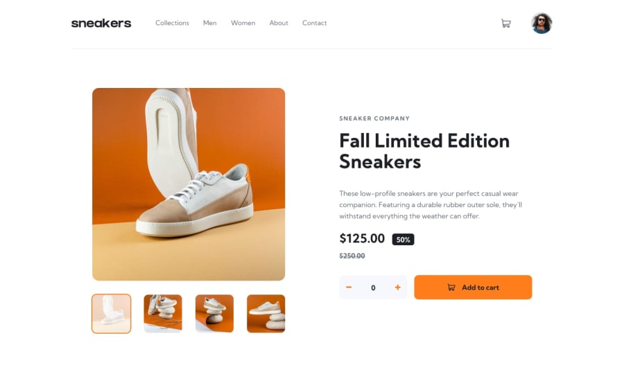
Sneakers Product Page(React, Flexbox, SASS, Responsive, Redux-Toolkit)
Design comparison
Solution retrospective
Any sort of feedback would be much appreciated, thank you.
Community feedback
- @crsimpson5Posted over 2 years ago
Hey David, great job on your solution! The styling looks great, and I love the mobile nav and cart menu. One suggestion I have is using button elements for things like the cart button and the photo gallery, that way they can be interacted with using a mouse and also keyboard. The plus and minus buttons are really hard to click; I think they could have the full height of the container.
Your code looks nice and clean, too. Well done 🙂👍
Marked as helpful0@David-Henery4Posted over 2 years ago@crsimpson5 Thank you mate, I did notice the small plus & minus but not until after the solution was submitted. Great spot on the cart button and photo gallery! I'm going change them when I get the chance. But thanks again on the feedback mate, much appreciated thank you 👍
1
Please log in to post a comment
Log in with GitHubJoin our Discord community
Join thousands of Frontend Mentor community members taking the challenges, sharing resources, helping each other, and chatting about all things front-end!
Join our Discord
