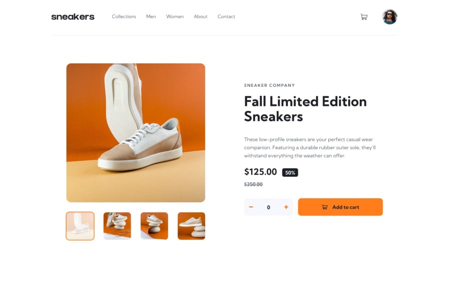
Design comparison
Solution retrospective
I enjoyed building this project and it is fully responsive. However I needed to finish the project quickly to add to my portfolio causing me to leave out some details for mobile screens. Some of these details include making the width of the cart take up the whole width, making the menu bar take up the left side with an overlay e.t.c Let me know what you think of the project in general and whether it still looks good on small screens. Thank you in advance!
Community feedback
- @mattari97Posted over 2 years ago
Hi Clarence. I like your solution and I think is is looking close to the design on desktop and mobile minus some small details you already outlined yourself in your comment.
- Regarding the fixes you need to make on mobile, I think the best advice i can give you is to work with a "mobile-first" mindset on your next projects. Almost all the time you will add complexity to your styles at larger screen size. For exemple almost all elements would generally be stacked on mobile which is the default behavior of a
display: blockelement. Then with your media queries you would add somedisplay: flexordisplay: gridetc... depending on your layout. In this project the slider is full width on mobile as well as the header. So you pretty much need to add properties later because overwise you'll need to override a lot of them in your media queries. Here you later add a max-width for the header and center it on the screen with maybe amargin-inline: autoproperty. Same for the slider. You add max-width, padding, border-radius, etc... Here is the logic i try to explain with my poor english skills:
/** Mobile **/ .some-class { /** add default styles like colors, background, font-size, etc... **/ } /** Tablet **/ @media(min-width:768px){ .some-class { /** Add complexity **/ } } /** Desktop **/ @media(min-width:1280px){ .some-class { /** Add even more complexity **/ } }-
A little suggestion for the cart modal: a good ux pattern in my opinion is to use a "close when clicking outside" method. It means that if the cart is open; any click outside of it will close the modal because if the user does click on another element on the page it generally means that he is "done" with the modal. I made a little example for you on codepen.
-
I really like the click effect you've added on the quantity picker buttons. It's smooth and everybody likes a little bit of feedback like this.
-
I think the svgs inside your "previous" and "next" buttons for the lighbox would be placed better if you centered them in their container.
.next, .previous {
  display: flex;
  justify-content: center;
  align-items: center;
}
Anyway, Nice job and happy coding. Peace.
Marked as helpful1@clarencejuluPosted about 2 years ago@AntoineC-dev How've you been Antoine?, It's been a while since I've been on frontendmentor and I'm only just seeing your feedback.
It's beyond helpful and I'm grateful you went as far as creating a codepen to help me ( second time you've done this :) )
Thank you so much Antoine, I would love to get your contact so we could stay in touch! Have a great day...
1@mattari97Posted about 2 years ago@clarencejulu Hey dude! Welcome back! I gave you a follow on github and i would love to keep in touch ! I don't really know how tho i don't have twitter etc... Maybe send me a discord if you have one or anything. Or take my email address on my github if nothing else available.
Peace 😊
1 - Regarding the fixes you need to make on mobile, I think the best advice i can give you is to work with a "mobile-first" mindset on your next projects. Almost all the time you will add complexity to your styles at larger screen size. For exemple almost all elements would generally be stacked on mobile which is the default behavior of a
Please log in to post a comment
Log in with GitHubJoin our Discord community
Join thousands of Frontend Mentor community members taking the challenges, sharing resources, helping each other, and chatting about all things front-end!
Join our Discord
