Submitted 6 months ago
Sneakers e-commerce React & Tailwind
#react#tailwind-css#accessibility

@dev-paulL

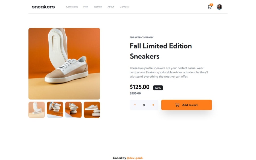
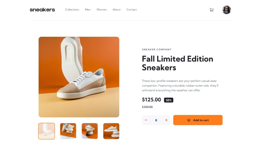
Design comparison
SolutionDesign
Solution retrospective
What are you most proud of, and what would you do differently next time?
This was my 3rd React project. I could have finished it in one go instead of working on it for just 15 minutes at a time 😅.
I didn't need any external help (besides tailwind docs); I modified the cart logic from my previous project and improvised the rest.
I decided to create a product object with properties like name, brand, images, price, discount.. instead of hardcoding the texts, to simulate a real product page.
We could imagine that every image would have a provided alt description as well.
What specific areas of your project would you like help with?Any feedback welcome 👍 I will keep improving and adjusting things on this project.
Community feedback
Please log in to post a comment
Log in with GitHubJoin our Discord community
Join thousands of Frontend Mentor community members taking the challenges, sharing resources, helping each other, and chatting about all things front-end!
Join our Discord